Data Visualization Over The Years

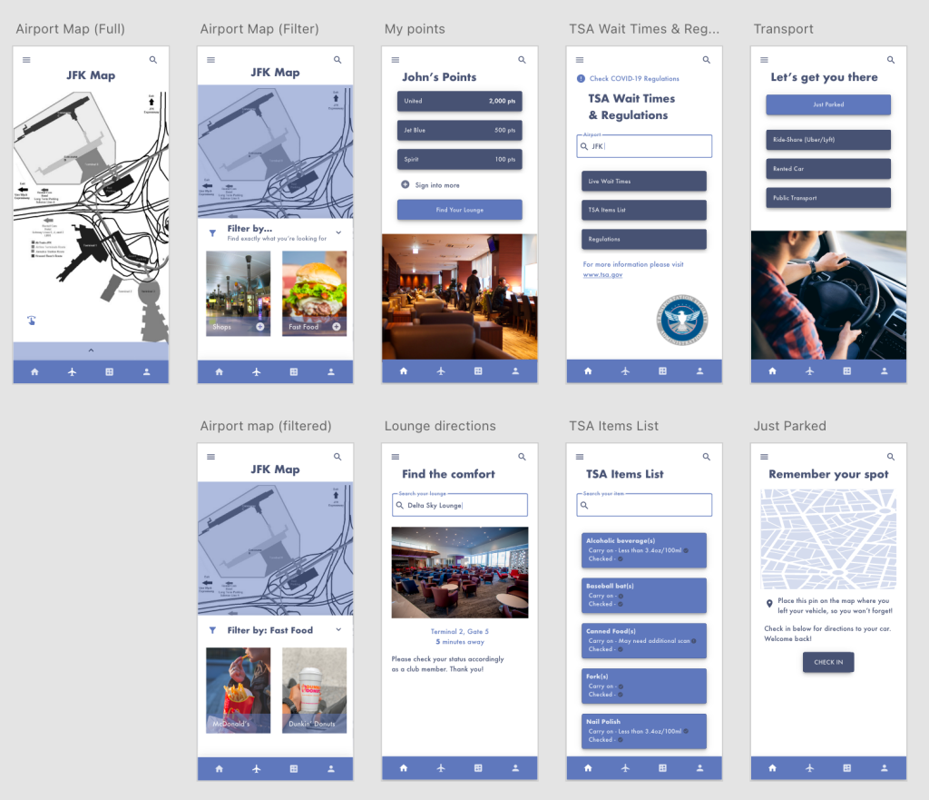
Data visualization has come a long way. From the creation of the pie chart to the digitally interactive infographics of today, it has been steadily improving. With advancing technology, we have been able to visualize data like never before.

Data used to be something only the professionals could understand. Through a series of numbers, calculations, and fancy terms, not just anyone could decipher its meaning. Once it began to be visualized and sketched out into innovative drawings, the public was able to comprehend it easier. In A Brief History of Data Visualization, by Michael Friendly, he goes in-depth about the many milestones in which data visualization came about. His findings show that with advancing technology came many additions to visualization.

Based on these technological advances, data visualization has benefitted us by being able to be shared with everyone. Anyone in the public can look at and understand a variety of data across a variety of fields. Add in quickly advancing technology such as computer programming and we can now directly interact with this data. Direct interaction allows us to understand patterns further and directly see how data points interact with each other.

The downsides of this are that we have so much data at our fingertips, what do we do with it? It is almost too easy nowadays to do a deep dive into something and gather a lot of data into a visualization that is off topic. The ease of visualization makes it easier for people to stray away from their specific data subject and instead give many meaningless data facts.

A good data visualization entails information that is actually useful to the study at hand and that will further explain a subject. A good chart will have a key of sorts for the viewer to decode the information. It will also contain varying contrast and hierarchies of color, type, shape, alignment, etc. to further get the data points across.

When looking at a good visualization, I most strongly respond to intriguing visuals and something that will be easy to decode. Some charts out there are either all raw data or all imagery that you can’t even begin to make sense of the data apart of it. I like a little something in between. Having this balance allows the viewer’s eye to be sucked into the stunning visuals and not be easily discouraged by too much data. Having a chart that can be easily decoded allows the viewer to get the information at their own pace.

Below is an example of what I think is a good chart:

Pantheon. Top 1000 Of The Globally Known People by Alexander Varlamov
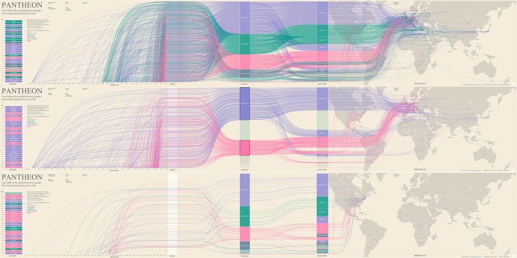
Source: https://www.informationisbeautifulawards.com/showcase/4065-pantheon-top-1000-of-the-globally-known-people

This chart features stunning imagery that the viewer will be intrigued to learn more about. As you get closer, you can clearly see the information and why the colors contrast and arc as they do.

Here is another example of a good chart:

Resettlement, Relief And Return by Jessica Gergen
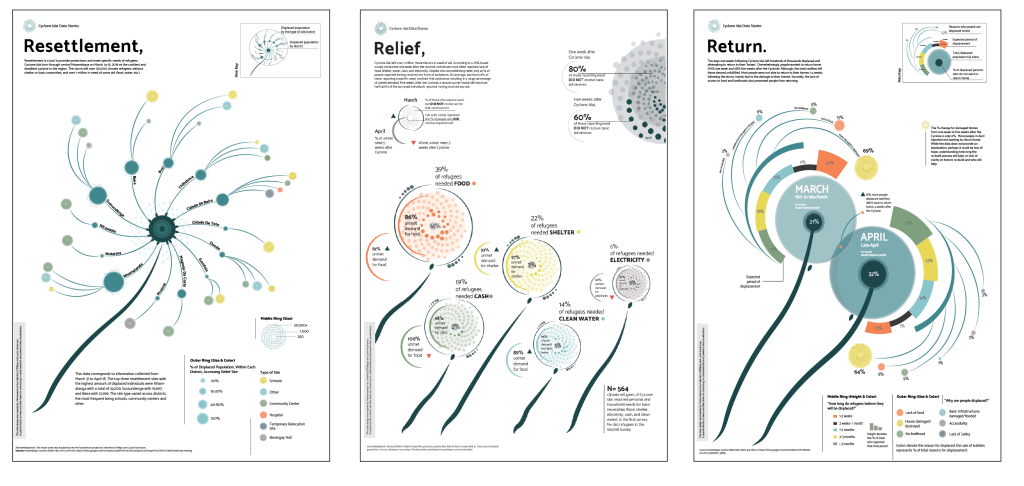
Source: https://www.informationisbeautifulawards.com/showcase/3874-resettlement-relief-and-return

It incorporates the data of the cyclones into the beautiful spiral imagery without overwhelming you. If you then want further information you can read the fine print and know everything.

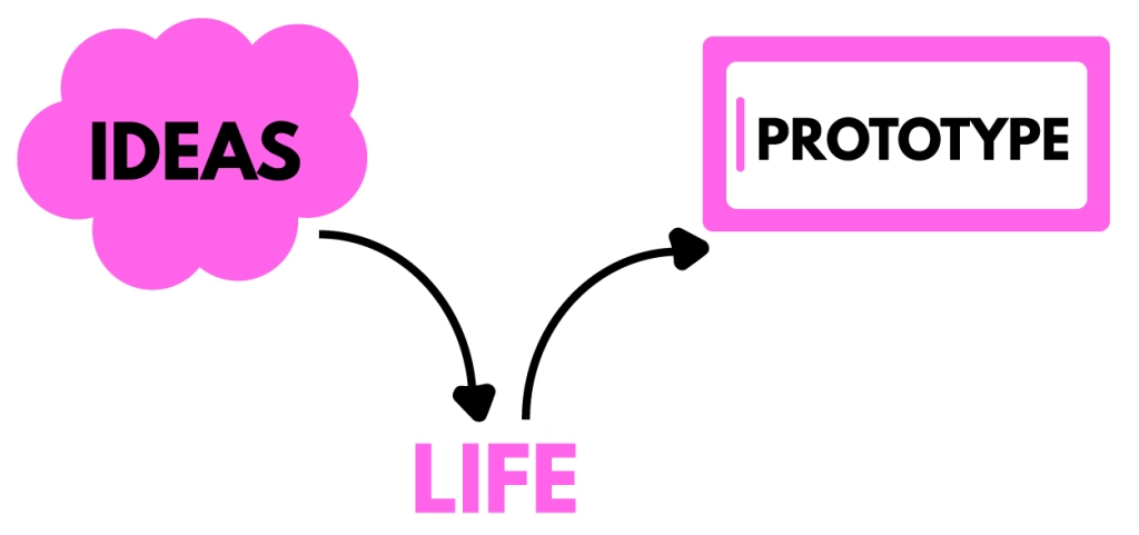
Data is visualized in many forms. Whether sketched out on a piece of paper or an interactive social media post,  it’s all data. The point of this visualization is to make these types of data known in an easy-to-understand way. Data visualization has definitely changed over the years and with advancements in technology, I know the best is yet to come.

References:

A Brief History of Data Visualization

The Final Prototype

The final prototype features a complete redesign of the app, Mindfulness Coach. This app is a self-care app that focuses on improving mindfulness and overall healthy habits. I worked with a partner to completely redesign this app, from backend to frontend. We focused on researching and using UX and UI best practices. Our final app prototype features well-designed screens with working functionalities.

The original Mindfulness Coach design was an “ugly app”. The screens weren’t well laid out and it was hard to navigate. After much user research, we created an information architecture that mapped out user navigation in an understandable way. By doing so, the functionality of our app was able to be used more efficiently.

This prototype features screens such as sign-in, customization, and different categories of self-care. We wanted the user to be able to customize their experience and track their productivity as they go through the app. Because of this need, we incorporated screens that ask the user personalization questions and allow them to write down their future goals and concerns. The prototype also features a mock live chatbot that talks to the user in “real-time.” Other features include different media such as videos, music, and live animations that walk you through various self-care activities.

Much research was put into finding color schemes and fonts to place on the screens. We ended up color-coordinating different self-care categories of the app so the user would remember and recognize which style of self-care they were using.

This prototype is a culmination of extensive UX/UI research. Having this background allowed for both a successful and realistic-looking prototype.

Prototype Link

Visually Designing Interfaces

After narrowing down the wireframes and functionality of an interface, it is time for more user interface design. User interface design, also known as UI design, is granular. It involves taking small components and turning them into functioning screens (A Comprehensive Guide To UI Design).

This process can seem overwhelming on a large scale, but it is all about organizing it down into smaller chunks. A common way of organization is by creating an interface inventory. This inventory can include all the small components that go into your designs, including but not limited to:

  • Typography
  • Images and media
  • Forms
  • Color scheme

      (A Comprehensive Guide To UI Design)

If you already have an existing interface, you can add these components to your inventory and synthesize what you still want to use. If you are starting from scratch, visual research needs to be done. 

When conducting visual research, make sure to research each type of component you will be adding to your inventory. This research is usually done by copying top designers and looking for successful design inspiration. No need to reinvent the wheel (7 simple & effective methods to get better at Visual/UI Design). These are some popular websites to find inspiration while researching:

On these websites, you can view screens, entire application layouts, or even just simple components. The possibilities are endless when it comes to inspiration.

Visual research for my app redesign

Once you have your components organized, you can then design them atomically. Atomic design involves building from these small components up to large interfaces, just as atoms go to molecules go to organisms go to templates go to pages (A Comprehensive Guide To UI Design). Take your components and slowly build them into working prototypes. Keeping to this design process will allow you to efficiently design cohesively and create successful design layouts.

There are a lot of free UI kits out there that can help you with this process. Many of these kits include smaller components and how they can be organized 0nto a screen. Taking the time to look at these successful designs by using free tools will help you tremendously. 

As you design screens, there are some important things to keep in mind. Luckily in 7 Rules for Creating Gorgeous UI there is a synthesized list of some tips and tricks to follow:

  • Light comes from the sky
    • Add in shadows to buttons that should be pressed; light where light is needed
  • Black and white first
    • Don’t get too distracted with colors and fonts while designing, design in black and white first to make sure the functionality of the design works
  • Double your whitespace
    • Give your items room to breathe as you place them on a page, don’t bombard the user with too much information close together
  • Learn the methods of overlaying text on images
    • Make sure the text can be visible if its on top of an image
  • Make text pop and un-pop
    • Give your words a hierarchy, those that are more important should pop off the page
  • Only use good fonts
    • Use fonts that are web safe and will be easy to read on the intended device
  • Steal like an artist
    • Most of this has already been done before, no need to start from scratch, so use what’s out there
My compositions of screens based off visual research

Following these organization and inspiration processes will lead you to success in designing user interfaces. Always make sure to keep things cohesive and functional.

Synthesizing user flow and layout.

After finding insights from user research, it is time to start designing the layout of your screens. It is important to use your user research in order to figure out the best user flow and layout that will be successful in your final product. Designers accomplish these added insights by creating information architectures and wireframes. Read below to find out about the processes for creating and using both of these tools.

“Information architecture is the practice of deciding how to arrange the parts of something to be understandable” (Information Architecture. Basics for Designers.). You now know all the elements you must include in your product, based on user research, but how will you go about making the use of them understandable? An information architecture, also referred to as IA, can go a long way in mapping out this understanding.

Information architectures are like flowcharts. They consist of shapes that contain different navigation elements and pages within an application. There are two main rules most designers follow when making an IA:

  • Organizing it through a visual hierarchy (that is, a hierarchy of features, functions, and behavior)
  • Creating a legend for displaying different types of features, interactions, and flows.

      (The Comprehensive Guide to Information Architecture)

The IA not only holds each individual page but actions and functionality as well. You can add in as much detail you want to it, including what type of search engine will be there or exactly what page a button will lead you to when pressed. It is all about organizing the functionality and making it easy to use.

My Information Architecture for a self-care application

Once you map out your information architecture, you can sketch out the layout of your screens. These sketches, digital or print, are known as wireframes. They are a way to get user flow presented visually. It is a low-cost and low-fidelity process. Wireframes are not the final product by any means and can be changed at any moment. The purpose of wireframes usually is to:

  • Present info that will be displayed on a page
  • Give an outline of structure and layout on a page
  • Convey overall direction and description of the user interface

      (How to make your first wireframe (+ video!))

Once you sketch through this process, when you arrive at your final product you will know what to do and how to move it forward. Wireframing is just a stepping stone in getting closer to that working prototype.

Although wireframing consists of simple layouts, it can be daunting to sit down and start making them. They need to be based on research and contain a good functionality to them, something that is hard to do if you go blindly into it. Below is a list of tips for approaching the wireframing process:

  • Do your research: user research must be the reason behind your sketches
  • Prepare your research for quick reference: come up with a list of your main goals and cool features to look at while designing
  • Make sure you have your user flow mapped out: know where your users are coming from and where you want them to end up, a good information architecture can help with this
  • Draft don’t draw, sketch don’t illustrate: keep it simple, not too many small details
  • Add some detail and get testing: add detail from top-down and left to right, start connecting form and functionality
  • Start turning your wireframes into prototypes: move your wireframes to the next step

      (The Definitive Guide: How To Create Your First Wireframe)

By following these guidelines, you can make sure your wireframes will be useful to you in the future. 

An example of some sketched wireframe screens with notes

So start designing for function. Figure out how your user is going to tap through your prototype and what kind of screens they will be expecting. Remember, you can always iterate.

Give life to your data.

In the design process, after collecting user data, your next step is to define your data. To be able to define data, you must analyze it and present it in a way that is helpful to you as a designer. Two key ways to find this definition are by creating empathy maps and personas. By completing these processes, you can further analyze your data and find a greater understanding of your user.

“An empathy map is a collaborative visualization used to articulate what we know about a particular type of user.” Making this map will help to:

  1. Create a shared understanding of user needs
  2. Aid in decision-making

      (Empathy Mapping: The First Step in Design Thinking)

Although putting all this information together into a map may seem daunting, it stems from user data. It includes the data you have already collected, consisting of repeating trends and direct quotes, that will be useful to add to the map.  Some designers even have their users directly fill the map in, coming straight from the source. Other times, it takes some assumption and analysis of data to complete it.

An empathy map consists of what the user says, thinks, does, and feels. Each of these categories, plus any other you decide to add, will offer a new insight to your design process. Here is a list of what is generally included in these sections of the empathy map:

  • Says: ideally contains direct quotes from research; something the user would most likely say
  • Thinks: what the user might be thinking, either based off what they shared or what you assume they might be hesitant to share; what occupies their thoughts and what matters to them
  • Does: what they physically do with the product; what they do in their lifestyle
  • Feels: whatever emotions they express during user research, what worries them, what excites them etc.

       (Empathy Mapping: The First Step in Design Thinking)

An example of an empathy map I created

Taking the time to delve into all these categories will allow for more opportunities to find new insights. Once you complete your empathy map, you can use it for a variety of reasons. You can use the map to figure out your overall design challenge, what the main issues you need to be focusing on are as you iterate. You can also look at the map through Maslow’s Hierarchy of Needs, determining what the user needs first and foremost and working your way up to more trivial needs. Lastly, you can use your empathy map as a background for creating personas (Empathy Map – Why and How to Use It).

Personas offer more in depth knowledge of your user. They take the synthesized data and place it into the form of a realistic user. This process allows the designer to focus on “one user,” which actually encompass the majority of your user groups, rather than all their users at once. The following are 7 easy steps in creating a persona:

  1. Research
    1. Get user data about your target audience
  2. Segment your audience
    1. The persona is a small segment of your target audience, it isn’t just one person
  3. Set demographic info
    1. Include researched background info on your user (name, age, marital status, job, personality, etc)
  4. Describe persona background
    1. Write down details about their background, tiny details can give good insight as well; avoid confusion
  5. Define persona goals
    1. See if the goals of your product align with the needs of your user
  6. Motivations & pain points
    1. Shows you how to win their hearts and keep them loyal to the product
  7. Add other ingredients
    1. Add more info about the user’s skills, tech level, influences, etc

      (How to Create a Persona in 7 Steps – A Guide with Examples)

An example of a persona I created

Once you create this persona, you will have someone in mind to think about as you make more design decisions. It will be a reminder for you and your team to focus on the user, making sure their needs are being met.

These processes of synthesizing data are key parts to the design process. Without them, it would be very difficult to find a direction to move forward in. This allows you to know your user well and find out what your research about them actually means. Doing these processes will go a long way in terms of actually understanding your audience.

Research Is The First Step

When you think of a designer, not many think of research. People’s minds tend to go to beautiful work displayed in seamless ways. But being a designer is about a lot more than looks; good designs must have good functionality as well. This is where research comes in.

Researching for an upcoming design can take on a variety of forms. Although there is much ambiguity in the design research process, most designers follow these basic steps:

  • Review your product and solution to a problem
  • Research and document findings of competitors
  • Complete a competitor analysis by analyzing the strengths and weaknesses between competitors
  • Conduct user interviews surrounding the product

These steps are just the tip of the iceberg in the complete UX research process, but they are offered as a starting point.

Competitive analysis is a huge task that reaps many benefits in design work. It is defined as “Identifying your competitors and evaluating their strategies to determine their strengths and weaknesses relative to those of your own product or service” (A Product Designer’s Guide to Competitive Analysis). Taking the time to do this analysis will allow designers to find what’s lacking in the product market and soar to their success.

To complete competitive analysis, researchers generally pick from 3-5 competitors they want to study. These competitors can either be direct, those who do what you do and have the same target customers, or indirect, those who offer something similar to what you offer (How To Do A UX Competitor Analysis: A Step By Step Guide). Once competitors are decided upon, there are a variety of factors you can look at in order to assess their products. Some factors, besides overall strengths, and weaknesses, include but are not limited to:

  • The tone and copy of the competitor
  • Good and bad features
  • User reviews
  • Wait/load times
  • Customer service
  • Design

      (How To Do A UX Competitor Analysis: A Step By Step Guide)

Once this information is found, researchers use their analytical skills to find ways to use this information. They analyze the information in terms of their product and how they can go about offering a more innovative solution.

Part of my own competitor analysis
Takeways of my competitor analysis

Next, is user interviews. Just like any other interview, these interviews are cheap and consist of questions and answers. But specifically in user interviews, there are a few things to keep in mind in order to find success. In terms of the interview process, the user is the top priority. Make them comfortable by sitting down across from them and staying engaged. Don’t become a distraction by taking notes. Having someone else present to take notes or record the interview is a good idea to help keep the interview focused on the user (How to Conduct User Interviews). Besides focus, you should also make sure not to persuade the user in any way. For example, being in an environment surrounded by your branding can pressure the user to say positive things about your brand (How To Conduct User Interviews Like A Pro (UX Design)). Try to keep things as neutral and objective as possible.

As for your interview script, make sure to get a good background of the user and not mislead them. Ask more open-ended style questions about how they are feeling and their approach to things rather than just asking what they need from your product. Again, focus on the user.

Some interview questions from my own user interview script

Overall, this research process will help tremendously in the final product design. When product designers go back to revamp their older product versions, it is UX research that is most important to them. This is where they will find valuable information about the user need’s in order to help them succeed.

Prototyping At Its Finest

Prototyping is a very important step in the mobile design process. It allows for existing ideas to come to life and for actual screen functionality to work. It also allows for a great deal of user testing, in order to know how the flow of the app actually functions and what features need improvement.

Tools such a Figma, Adobe XD, and InVision can help in both creating well-designed screens and prototyping them as well. These resources allow you to link different screens together to form a working online prototype.

However, the prototyping process isn’t just about linking screens together, it is about so much more. In Prototyping: Learn Eight Common Methods and Best Practices, they explain the four key components that prototyping involves. Those include:

  • People: those you are testing and observing
  • Objects: static and interactive, the actual prototype and other people/objects the prototype interacts with
  • Location: places and environment
  • Interactions: digital or physical, between people, objects, and location

These components all allow for a prototype to be made and tested accordingly. Without paying attention to all of them, your prototype could be lacking something important.

Prototypes are made in a variety of ways. The digital era has blessed us with prototyping tools that make our app prototypes look just like the final product would, but there are so many more ways to do it. From prototyping on paper, to using materials such as legos, to roleplaying a user scenario of the product, the possibilities are endless. The goal we want to focus on in any of these mediums is to bring ideas to life and to find the right flow for the prototype to have.

Some tips for creating prototypes are to ask yourself what your idea is about and what questions you want to ask. Other tips from Creating a High-Fidelity User Interface & Interactive Prototype in an hour, involve:

  • Using familiar tools that can be used across all platforms
  • Finding a flow for big ideas rather than jumping into specifics
  • Looking at design inspiration for brand identity and cohesive prototype layouts
  • Using visual hierarchy
  • Using as close to actual content as you can (not lorem ipsum)

These tips will come in handy when moving through the prototyping process. It is about seamless design on both the screens and the working prototype.

Designer Ricky Lyman initially struggled with app design and the prototyping process. As he attended conferences and improved his work he discovered that less is more. This notion involved the best prototype designs having functionality that was absolutely essential to the product, with nothing clunky added (How one designer prototyped prototyping).

Lyman curated a set of prototypes, to be available for other designers, that feature these minimalist wireframes. They only offer exactly what the product needs and nothing more. He calls his work ProtoMVP (How one designer prototyped prototyping).

Hearing about Lyman’s projects and all these tips while prototyping has been really crucial to my own work. I initially went into the prototyping process by just linking screens and mindlessly hoping it would make sense. I didn’t take a step back to look at the actual flow of the product and how each functionality was actually necessary. I can now see how important it is to focus on what makes a good prototype design in order to actually create a worthwhile prototype.

The Best Ways to Design for Mobile

Mobile design is made up of seamless designs on small screen real estate. It has to be both visually pleasing and have a purpose behind its functionality. There are many ways to make a screen look pretty, but do they actually benefit the user? Let’s talk about some of the best guidelines to follow when designing for mobile.

Mobile apps should be easy to use. When someone is using an app on a mobile device, they should find it both easy to read and navigate. An important feature to think about for usage purposes is the “thumb zone.” While the zone changes as screen size increases, the thumb zone is the general area your thumb is in when you hold your phone. Since most users hold their phone with one hand, the thumb does all the work when tapping through screens. Placing your most important navigation and functionality in this zone will allow the user to easily tap it and use it more frequently (Mobile Design Best Practices).

While this zone is easy to use, other zones on the screen are practically unreachable by the thumb. These zones, also known as red zones, take more effort to reach on a screen than the desired thumb zone. Consequently, they should hold information that doesn’t need to be tapped often or by accident. Destructive actions such as delete and reset should be placed in these red areas because no one needs to hit those often or by mistake (Mobile Design Best Practices). Following these rules of thumb will make for optimum usage of screen space.

Another guideline to keep in mind while designing is the user. When it comes to using technology, users expect speed. Now, everything is at the touch of our fingertips in a matter of seconds. Because of this expectation, your app should follow functionality that keeps this user speed intact. Here are some examples of protecting this speed while designing:

  • Only require a log in for private and necessary info: If the user has to log in all the time and no private information or items are being saved then it isn’t efficient.
  • Show the screen loading gradually: Having your screen indicate a loading gesture will allow the user to know something is happening so they don’t get impatient. A good way to implement this gesture is to have your blank screen be visible and have the fields become slowly filled in. This way, the user doesn’t have to stare at an annoying spinning circle and they can actually see the app coming to life.
  • Provide feedback: Audio or visual feedback after a user completes or uses a certain functionality will allow them to know the app is running properly and efficiently.
  • Minimize data fields: Having to type in too much information, especially when not necessary can be tiresome. Only having input fields that are absolutely crucial will take away from this bothersome process to the user. A good example of efficiently implementing data is allowing other parties to do the work, such as signing in with Facebook or Google.

      (Mobile UX design principles and best practices)

These examples are just the beginning of the mobile design process. There are many helpful resources out there that list more practices to keep in mind. Below is an example of my own mobile designs, which I attempted to make while thinking of these practices.

I still have much room for improvement, but it’s helpful to be thinking like a mobile designer while creating these screens.

Resources:

Mobile UX design principles and best practices

Mobile Design Best Practices

The Guide to Mobile App Design: Best Practices for 2018 and Beyond

Visual Designs for UI

When it comes to designing the UI of a mobile app, every detail is important. From the spacing between navigation icons to the way the screen real estate is used, every detail must be optimized for the user. With that being said, there are many things to keep in mind when creating the visuals of a new platform.

Transferring ideas over from your wireframes can prove difficult if little visual research is conducted. It is crucial to look at successful examples of different UI that are already out there. Using UI templates can be a good starting point for making sure your visuals look professional. Here are links to some helpful UI kits:

Besides just UI kits, it’s also important to research color palettes, typography, and icon graphics before starting.

Always remember there is an order to the UI design process. Steps aren’t just done randomly. Research and careful planning go into every element seen on a screen (A Comprehensive Guide To UI Design). There is a lot of information that is useful out there, it’s just a matter of finding it.

As explained in the article, 7 Rules for Creating Gorgeous UI, there are some general guidelines that you should follow when designing for UI. The guidelines include, but are not limited to:

  • Light comes from the sky: add shadows and lighting to your different features and functionality, this will make it more realistic looking, like a 3D object you can touch.
  • Black and white first: by first designing in black and white, you will be able to create the proper visual layout without adding too much unnecessary color. Work your way up to adding more color, only with purpose in places that need it.
  • Double your whitespace: the last thing users want to see is a crowded screen. Adding more whitespace allows both your information and the user to breathe as they navigate through the app.
  • Learn the methods of overlaying text on images: text cannot be placed randomly on images because readability is so important in UI design. Allowing yourself to practice with placement, shadows, blur effects, and more will allow your type to pop against interesting photo backgrounds.
  • Make text pop and un-pop: speaking of popping, know which text to place where. Play around with sizing, stroke, font style, and color as you make type pop in particular places. There are always ways to place and take away emphasis.
  • Only use good fonts: based on my research of UI design, most mobile apps use san-serifed fonts. It doesn’t always have to be this way, but this just goes to show how far font research can take you. Use fonts that will be legible in small sizes and that will be unique to your branding.
  • Steal like an artist: just as UI kits were mentioned, there is a lot of inspiration out there to steal from. Continue researching to find good professional work to make uniquely your own. The possibilities are endless.

Just know that you don’t have to follow everything on this list. These are merely suggestions for you to start getting your feet wet in the UI design world. Overall, just make sure to have a beautiful final product without sacrificing functionality. Happy designing!

An example of my UI Design process. There is always room to be better.

Wireframes + Visual Research

As discussed in my last post “Creating Your Information Architecture & Wireframes,” wireframes are a key part of the UX design process. Making sure to have wireframes for all of your screens is a step toward getting yourself set up for your final prototype. Many of these wireframe screens should incorporate details, as in-depth as possible. Changing one small functionality or graphic on a screen will help to indicate different features of the application.

Many apps have around twenty to forty beginning wireframe screens. Of course, more can always be added, but this amount is sure to include enough details for anyone looking at the wireframes. When building my wireframes, I chose to work from large to small. Focusing on my main screens and working down into subscreens with minor changes allows the work to be organized efficiently. Going off of these smaller screens into the functional details allows for you to remember things you want to include, rather than forgetting to add the feature to a screen altogether.

Choosing InVision freehand to make my screens allowed me to incorporate as many details as possible. From filter categories to possible places that would likely be searched by the user, I added in information to help my wireframes come to life. Rather than seeing just a few image placeholders, text was written to serve as a guide to those viewing my wireframes.

As far as visual research goes, the possibilities are endless. Taking the time to look at successful UI examples was particularly helpful to me. Here are some links to wonderful UI examples of inspiration:

By going through these examples, I was able to gather research and inspiration to incorporate into my own design. Being able to look at UI for other travel apps, similar to mine, allowed me to know what’s on the market and how others are creating travel designs.

I also researched different color schemes, graphics, and images to add to my design. It was helpful to explore all of these realms to really get a feel for my app’s branding. Here are some helpful links I used in the process:

I love how open the web is and how just about anything can be found with a little research. These websites, along with others, continue to help me with the research and inspiration process. As I find more useful pieces to add to my collection, I am one step closer to figuring out my UI design.

Always remember the importance of UI design. Now that the heavy work of UX design has been completed, UI design must also get attention. Don’t jump right into designing with random colors and fonts. Take the time to carefully select your scheme and what you want your app to be as a whole. This will pay off in the future.

I am glad to be able to put time and detail into all of these steps. I now have a process book worth of information that explains why I am doing what I am doing for my app redesign. Organizing myself in this way allows me to showcase my work and my overall work process.