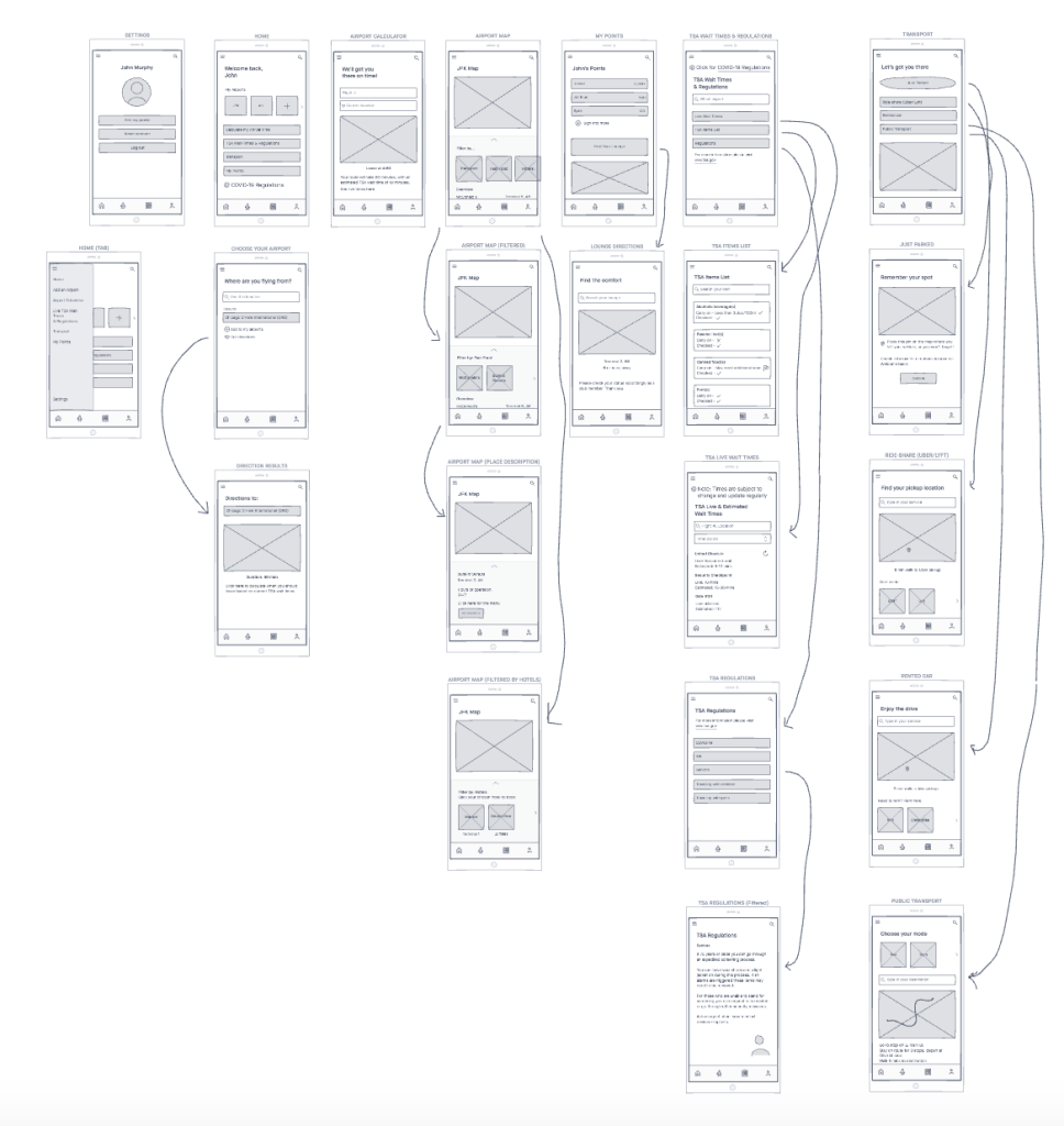
As discussed in my last post “Creating Your Information Architecture & Wireframes,” wireframes are a key part of the UX design process. Making sure to have wireframes for all of your screens is a step toward getting yourself set up for your final prototype. Many of these wireframe screens should incorporate details, as in-depth as possible. Changing one small functionality or graphic on a screen will help to indicate different features of the application.
Many apps have around twenty to forty beginning wireframe screens. Of course, more can always be added, but this amount is sure to include enough details for anyone looking at the wireframes. When building my wireframes, I chose to work from large to small. Focusing on my main screens and working down into subscreens with minor changes allows the work to be organized efficiently. Going off of these smaller screens into the functional details allows for you to remember things you want to include, rather than forgetting to add the feature to a screen altogether.
Choosing InVision freehand to make my screens allowed me to incorporate as many details as possible. From filter categories to possible places that would likely be searched by the user, I added in information to help my wireframes come to life. Rather than seeing just a few image placeholders, text was written to serve as a guide to those viewing my wireframes.
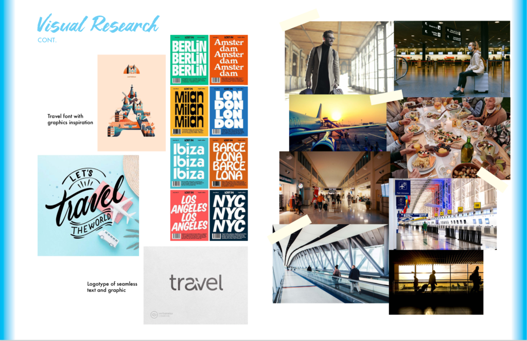
As far as visual research goes, the possibilities are endless. Taking the time to look at successful UI examples was particularly helpful to me. Here are some links to wonderful UI examples of inspiration:
By going through these examples, I was able to gather research and inspiration to incorporate into my own design. Being able to look at UI for other travel apps, similar to mine, allowed me to know what’s on the market and how others are creating travel designs.
I also researched different color schemes, graphics, and images to add to my design. It was helpful to explore all of these realms to really get a feel for my app’s branding. Here are some helpful links I used in the process:
I love how open the web is and how just about anything can be found with a little research. These websites, along with others, continue to help me with the research and inspiration process. As I find more useful pieces to add to my collection, I am one step closer to figuring out my UI design.
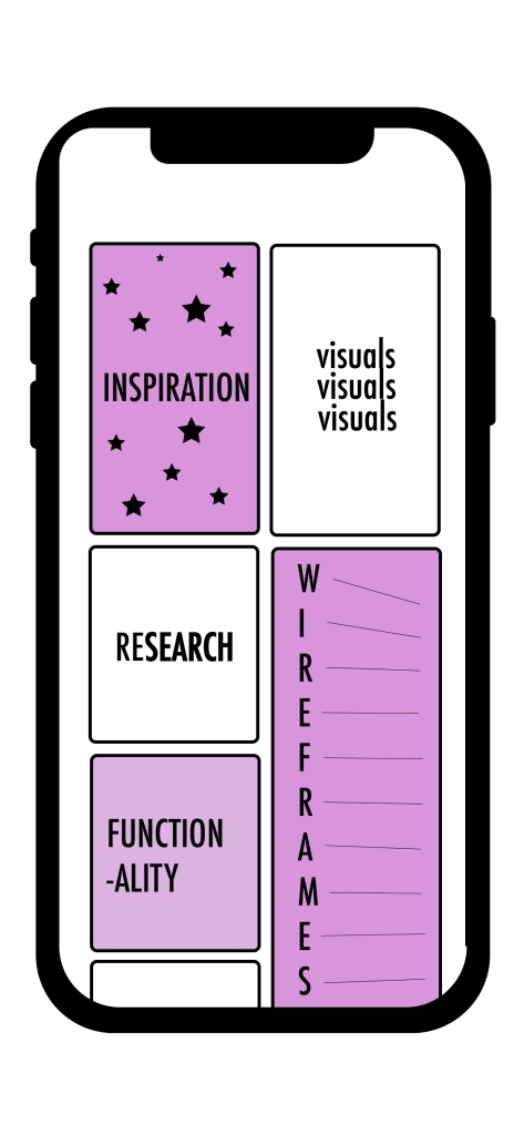
Always remember the importance of UI design. Now that the heavy work of UX design has been completed, UI design must also get attention. Don’t jump right into designing with random colors and fonts. Take the time to carefully select your scheme and what you want your app to be as a whole. This will pay off in the future.
I am glad to be able to put time and detail into all of these steps. I now have a process book worth of information that explains why I am doing what I am doing for my app redesign. Organizing myself in this way allows me to showcase my work and my overall work process.
