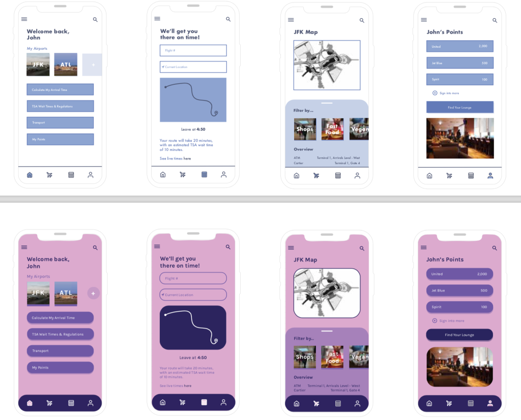
When it comes to designing the UI of a mobile app, every detail is important. From the spacing between navigation icons to the way the screen real estate is used, every detail must be optimized for the user. With that being said, there are many things to keep in mind when creating the visuals of a new platform.
Transferring ideas over from your wireframes can prove difficult if little visual research is conducted. It is crucial to look at successful examples of different UI that are already out there. Using UI templates can be a good starting point for making sure your visuals look professional. Here are links to some helpful UI kits:
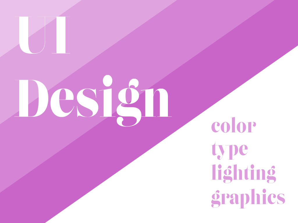
Besides just UI kits, it’s also important to research color palettes, typography, and icon graphics before starting.
Always remember there is an order to the UI design process. Steps aren’t just done randomly. Research and careful planning go into every element seen on a screen (A Comprehensive Guide To UI Design). There is a lot of information that is useful out there, it’s just a matter of finding it.
As explained in the article, 7 Rules for Creating Gorgeous UI, there are some general guidelines that you should follow when designing for UI. The guidelines include, but are not limited to:
- Light comes from the sky: add shadows and lighting to your different features and functionality, this will make it more realistic looking, like a 3D object you can touch.
- Black and white first: by first designing in black and white, you will be able to create the proper visual layout without adding too much unnecessary color. Work your way up to adding more color, only with purpose in places that need it.
- Double your whitespace: the last thing users want to see is a crowded screen. Adding more whitespace allows both your information and the user to breathe as they navigate through the app.
- Learn the methods of overlaying text on images: text cannot be placed randomly on images because readability is so important in UI design. Allowing yourself to practice with placement, shadows, blur effects, and more will allow your type to pop against interesting photo backgrounds.
- Make text pop and un-pop: speaking of popping, know which text to place where. Play around with sizing, stroke, font style, and color as you make type pop in particular places. There are always ways to place and take away emphasis.
- Only use good fonts: based on my research of UI design, most mobile apps use san-serifed fonts. It doesn’t always have to be this way, but this just goes to show how far font research can take you. Use fonts that will be legible in small sizes and that will be unique to your branding.
- Steal like an artist: just as UI kits were mentioned, there is a lot of inspiration out there to steal from. Continue researching to find good professional work to make uniquely your own. The possibilities are endless.
Just know that you don’t have to follow everything on this list. These are merely suggestions for you to start getting your feet wet in the UI design world. Overall, just make sure to have a beautiful final product without sacrificing functionality. Happy designing!