Mobile design is made up of seamless designs on small screen real estate. It has to be both visually pleasing and have a purpose behind its functionality. There are many ways to make a screen look pretty, but do they actually benefit the user? Let’s talk about some of the best guidelines to follow when designing for mobile.
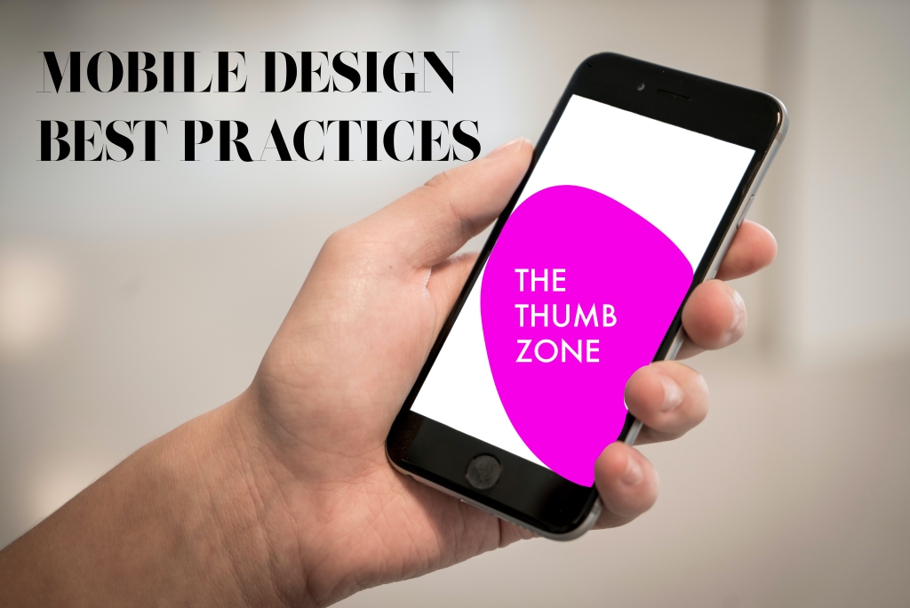
Mobile apps should be easy to use. When someone is using an app on a mobile device, they should find it both easy to read and navigate. An important feature to think about for usage purposes is the “thumb zone.” While the zone changes as screen size increases, the thumb zone is the general area your thumb is in when you hold your phone. Since most users hold their phone with one hand, the thumb does all the work when tapping through screens. Placing your most important navigation and functionality in this zone will allow the user to easily tap it and use it more frequently (Mobile Design Best Practices).
While this zone is easy to use, other zones on the screen are practically unreachable by the thumb. These zones, also known as red zones, take more effort to reach on a screen than the desired thumb zone. Consequently, they should hold information that doesn’t need to be tapped often or by accident. Destructive actions such as delete and reset should be placed in these red areas because no one needs to hit those often or by mistake (Mobile Design Best Practices). Following these rules of thumb will make for optimum usage of screen space.
Another guideline to keep in mind while designing is the user. When it comes to using technology, users expect speed. Now, everything is at the touch of our fingertips in a matter of seconds. Because of this expectation, your app should follow functionality that keeps this user speed intact. Here are some examples of protecting this speed while designing:
- Only require a log in for private and necessary info: If the user has to log in all the time and no private information or items are being saved then it isn’t efficient.
- Show the screen loading gradually: Having your screen indicate a loading gesture will allow the user to know something is happening so they don’t get impatient. A good way to implement this gesture is to have your blank screen be visible and have the fields become slowly filled in. This way, the user doesn’t have to stare at an annoying spinning circle and they can actually see the app coming to life.
- Provide feedback: Audio or visual feedback after a user completes or uses a certain functionality will allow them to know the app is running properly and efficiently.
- Minimize data fields: Having to type in too much information, especially when not necessary can be tiresome. Only having input fields that are absolutely crucial will take away from this bothersome process to the user. A good example of efficiently implementing data is allowing other parties to do the work, such as signing in with Facebook or Google.
(Mobile UX design principles and best practices)
These examples are just the beginning of the mobile design process. There are many helpful resources out there that list more practices to keep in mind. Below is an example of my own mobile designs, which I attempted to make while thinking of these practices.
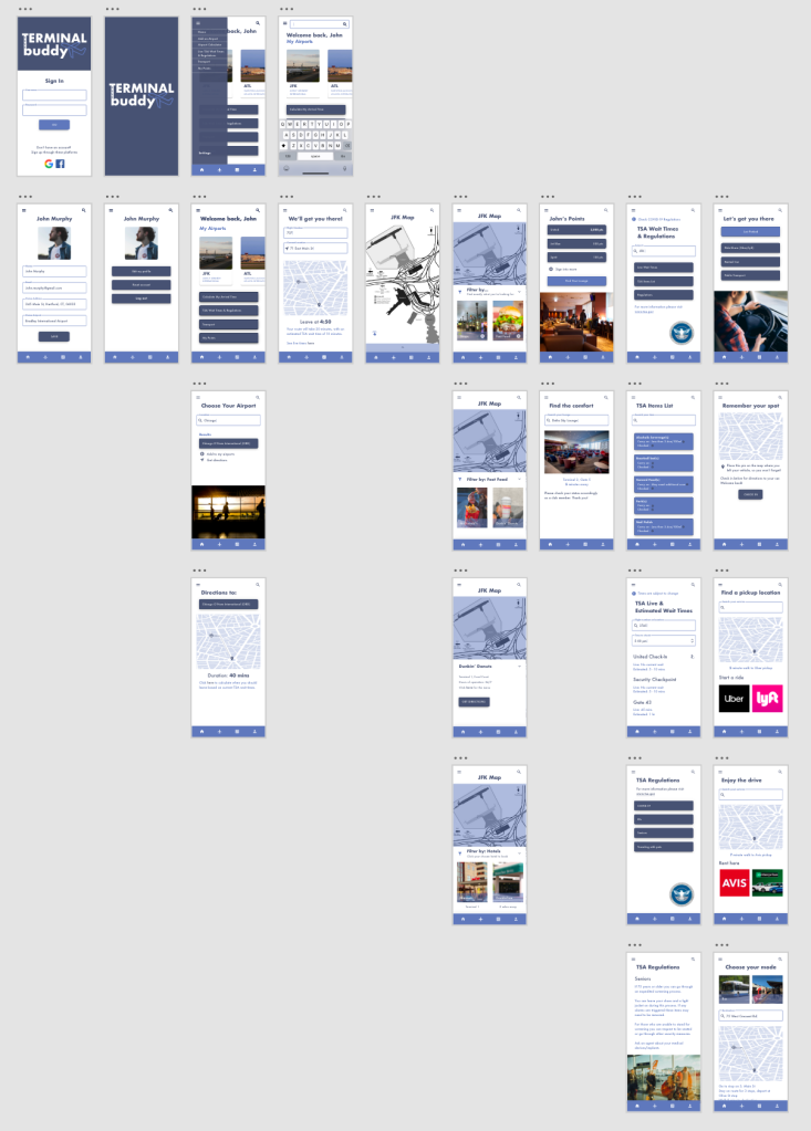
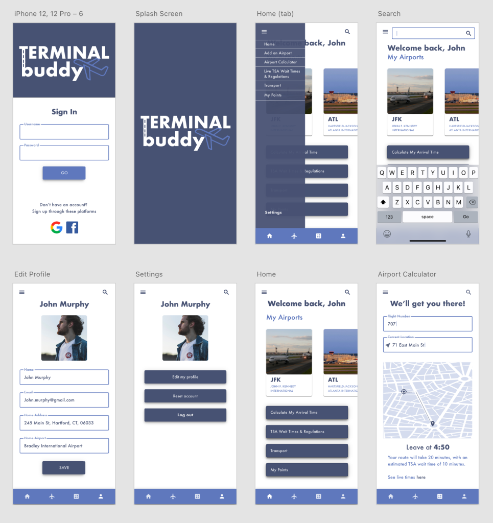
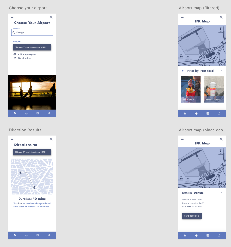
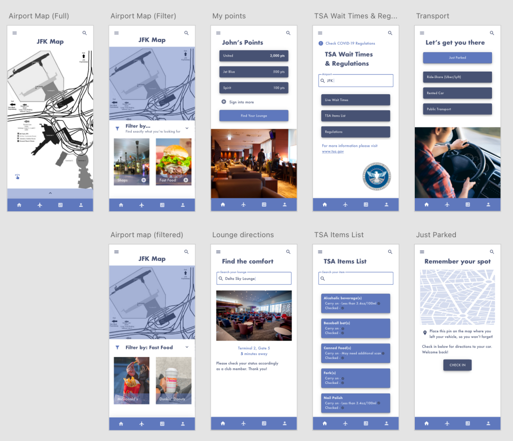
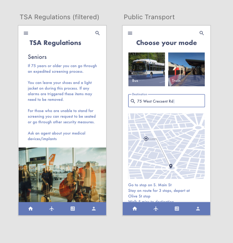
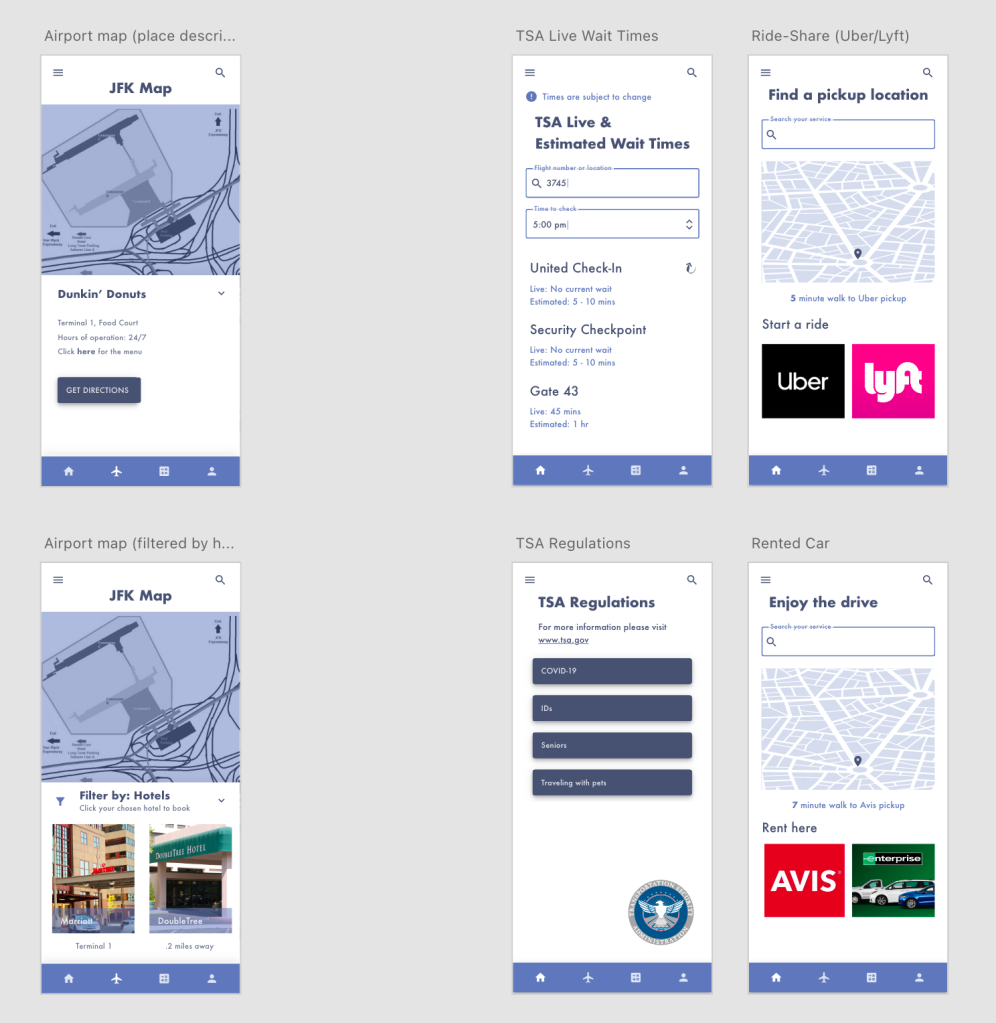
I still have much room for improvement, but it’s helpful to be thinking like a mobile designer while creating these screens.
Resources:
Mobile UX design principles and best practices
The Guide to Mobile App Design: Best Practices for 2018 and Beyond
 SHANNON'S DESIGN BLOG