Data visualization has come a long way. From the creation of the pie chart to the digitally interactive infographics of today, it has been steadily improving. With advancing technology, we have been able to visualize data like never before.
Data used to be something only the professionals could understand. Through a series of numbers, calculations, and fancy terms, not just anyone could decipher its meaning. Once it began to be visualized and sketched out into innovative drawings, the public was able to comprehend it easier. In A Brief History of Data Visualization, by Michael Friendly, he goes in-depth about the many milestones in which data visualization came about. His findings show that with advancing technology came many additions to visualization.
Based on these technological advances, data visualization has benefitted us by being able to be shared with everyone. Anyone in the public can look at and understand a variety of data across a variety of fields. Add in quickly advancing technology such as computer programming and we can now directly interact with this data. Direct interaction allows us to understand patterns further and directly see how data points interact with each other.
The downsides of this are that we have so much data at our fingertips, what do we do with it? It is almost too easy nowadays to do a deep dive into something and gather a lot of data into a visualization that is off topic. The ease of visualization makes it easier for people to stray away from their specific data subject and instead give many meaningless data facts.
A good data visualization entails information that is actually useful to the study at hand and that will further explain a subject. A good chart will have a key of sorts for the viewer to decode the information. It will also contain varying contrast and hierarchies of color, type, shape, alignment, etc. to further get the data points across.
When looking at a good visualization, I most strongly respond to intriguing visuals and something that will be easy to decode. Some charts out there are either all raw data or all imagery that you can’t even begin to make sense of the data apart of it. I like a little something in between. Having this balance allows the viewer’s eye to be sucked into the stunning visuals and not be easily discouraged by too much data. Having a chart that can be easily decoded allows the viewer to get the information at their own pace.
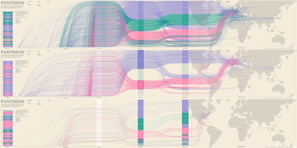
Below is an example of what I think is a good chart:

Source: https://www.informationisbeautifulawards.com/showcase/4065-pantheon-top-1000-of-the-globally-known-people
This chart features stunning imagery that the viewer will be intrigued to learn more about. As you get closer, you can clearly see the information and why the colors contrast and arc as they do.
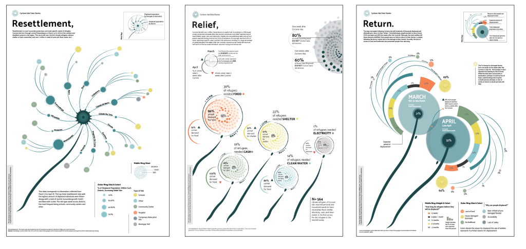
Here is another example of a good chart:

Source: https://www.informationisbeautifulawards.com/showcase/3874-resettlement-relief-and-return
It incorporates the data of the cyclones into the beautiful spiral imagery without overwhelming you. If you then want further information you can read the fine print and know everything.
Data is visualized in many forms. Whether sketched out on a piece of paper or an interactive social media post, it’s all data. The point of this visualization is to make these types of data known in an easy-to-understand way. Data visualization has definitely changed over the years and with advancements in technology, I know the best is yet to come.
References:
