Final Demo Reel
For my final demo reel, I wanted to create something that would capture the variety of my work as well as the creativity. I chose an upbeat song to help show the progression of my work. Then I created a flashy intro to introduce my audience to this work. Using the demo reel builds we had created during the year and my work from previous projects, I added them into the same composition in After Effects. I paid specific attention to the beat of the music and the timing each project came in at. I also made sure to pay attention to what looked best next to each other. Projects of similar color schemes, themes, and or speeds were placed next to each other to help with transitioning. I also added in certain transition animations to create a more seamless look.
I am very happy with the outcome of this demo reel and am proud of all the work I have accomplished this semester. This reel shows major progress in comparison to my earlier motion design work and I know I have developed my skills further. I love the creativity of each piece and all the imagination that comes along with creating motion designs.
Final Motion Design: Title Sequence
When given the task of creating my final project, I immediately knew I wanted to do a title sequence. Although I have seen thousands of title sequences in my life, I never fully appreciated them until getting introduced to their wide variety in the world of motion design. Now, whenever I see a title sequence come onto my screen, instead of skipping past, I take the time to really look at all the details of the piece. Each title sequence I look at comes with a new fascination. I knew when creating my piece that I wanted to inspire others just as I had been inspired.
To begin my research, I thought of my favorite television shows that were memorable to me. I wanted to create a spin off of a classic, something anyone could recognize. I enjoyed the idea of using a catchy song and symbolism that only true fans of the show would understand. Instead of it being a title sequence that would introduce the show, it would be a title sequence to re-introduce old fans of the show and bring them back into its world. I watched many title sequences including Friends, The Office, Full House, Survivor and more, becoming more inspired with each one.
I ultimately made the decision to focus on the popular television series “The Office” for my title sequence. Although the original title sequence depicts simple shots of the characters in the office setting, I wanted to go beyond this setting to create animations that were meaningful to the show’s history and success. The video above shows the original sequence, not with the original sound. I watched this title sequence over many times, gathering elements I could re-incorporate and or change. I also researched the main characters of the show. I wanted this to be a shorter piece that would have meaning to the viewer as they watched and reminisced. I decided to focus only on the main characters who were the “fan favorites.” By doing this, I was able to show not only names on a screen, but a personalized view into each main character of the show.
I began by creating various drawings for each character. Each drawing was chosen to be viewed as a symbol of who they are as a character and their impact on the series. I took much time in choosing each symbol, as I wanted to create something special. The symbols I decided on ended up keying into memorable parts of the series, almost as an inside joke to its loyal viewers. If you have seen the show in its entirety, each of these drawings will be guaranteed to spark a memory in you. As I continued with the drawings, I knew this was the right way to go about this piece and create an updated homage to a show everyone loved.
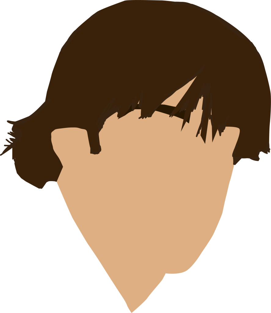


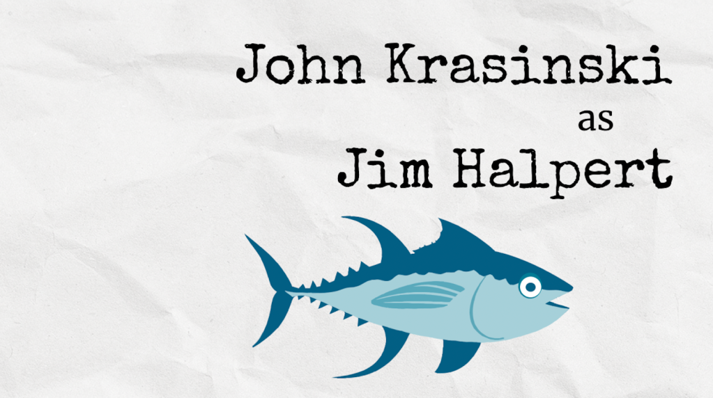
Above are the drawings I created for the character, Jim Halpert. When I first thought of Jim, I immediately thought of his iconic hairstyle that many know and love. The image to the left was what I first created in Illustrator, by tracing an image of Jim’s hair with the pen tool. After putting this in my piece, I noticed how it was just floating on the page and looked out of place, so I added Jim’s usual attire to him. Since I hadn’t created created personas like Jim’s for every character, I was given the advice to change his symbolism into something else. When thinking another iconic Jim symbol, I immediately thought of Tuna, his nickname given to him by Andy. I decided to trace over a tuna fish in Illustrator and came up with this incredible looking fish. I wanted to make this symbol interact with his name so I animated it in After Effects to look as if it was swimming across the screen.
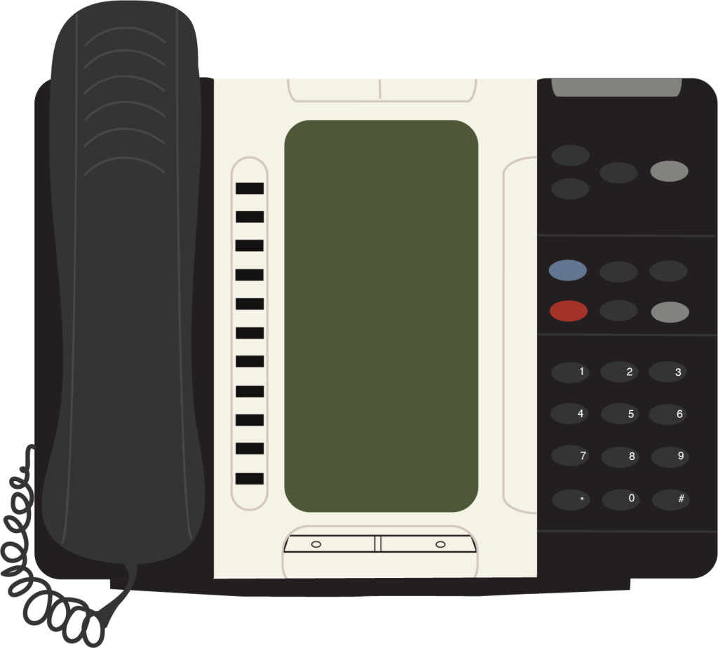
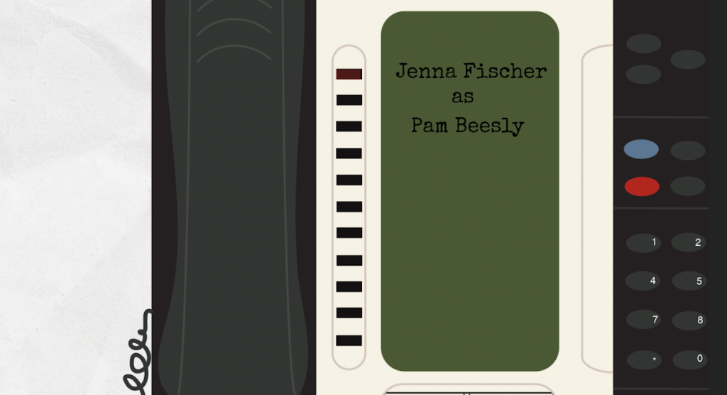
I created this phone for Pam Beesly’s character, as she was known for being the love-able receptionist. I spent much time creating this in Illustrator, tracing every finite detail of a real office phone to create a digital version. I was very pleased with creating this and knew it would offer an interesting perspective to display her name on the phone screen.
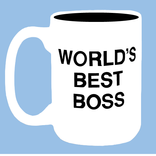
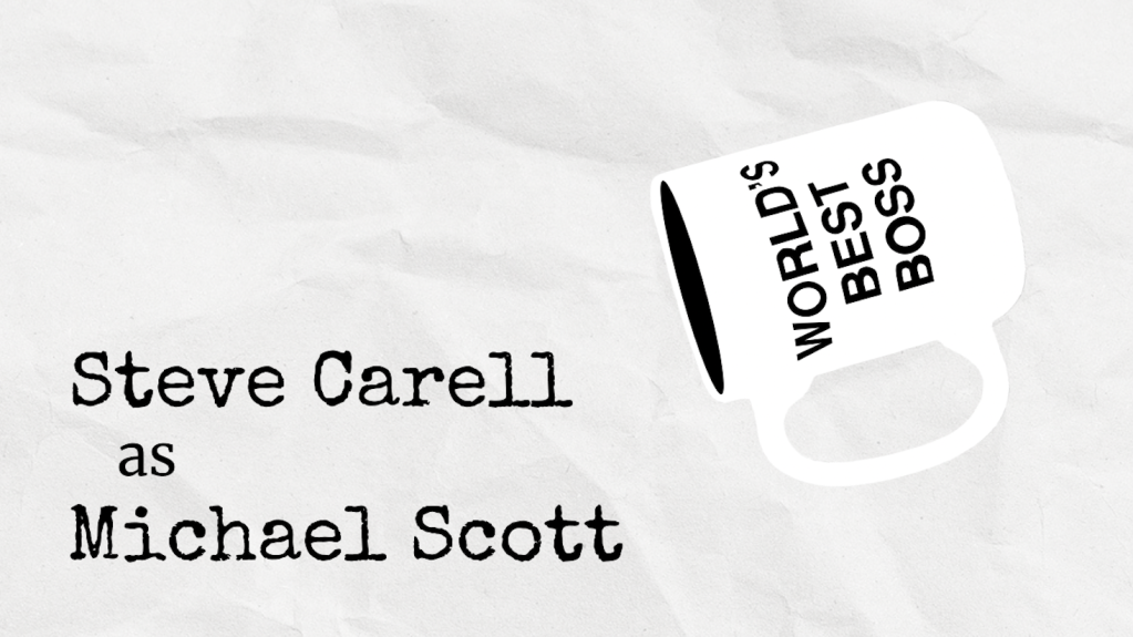
I created this symbol for Michael Scott’s character, whom many believe to be the world’s best boss. This mug is a well known item that many people will recognize from the familiar clutter of Michael’s desk in the series. I traced the mug outline in Illustrator and ended up tracing the letters on the mug as well, to get the optimal realistic curvature a real mug would give. I knew I wanted to animate the mug in an interesting way, rather than having it sit on the screen. I decided to animate it in After Effects and have it fall across the screen, adding movement alongside the name of his energetic character.


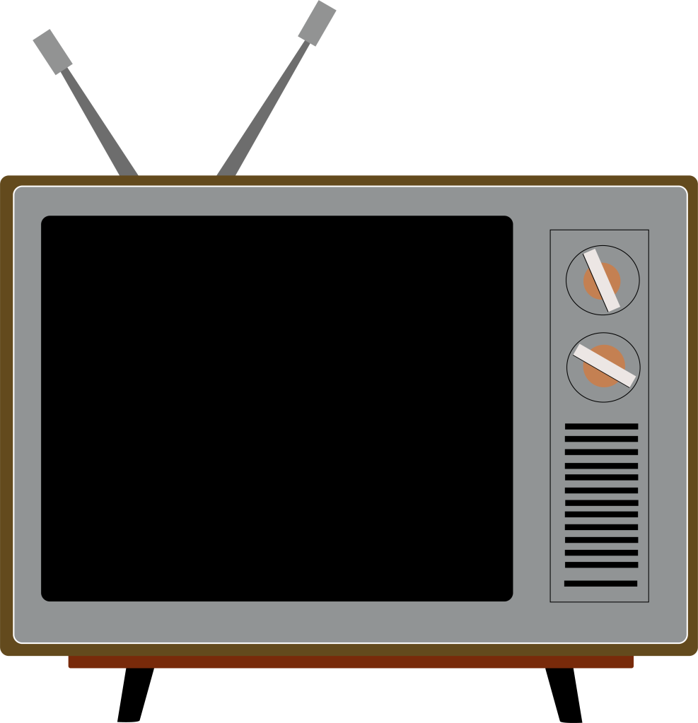
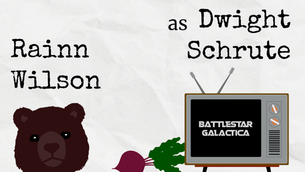
Lastly, for Dwight Schrute’s character, I created symbols from an infamous Dwight related scene, “Bears, Beets, Battlestar Galactica.” I used Illustrator to trace over real images of a bear, a beet, and a television set, which I later added the Battlestar Galactica font to in After Effects. I placed them on the screen coming in at this set order, knowing my audience would immediately recognize the phrase these drawings provoked.
Above shows how these images were placed into each scene, along with the character’s names. I wanted to have variety in the way I created these layouts, just as the show had much variety in its episodes. Combining these images, I animated movements for the drawings in After Effects and created the type to look as if it were being typed out by an office typewriter. I created each background to look like crumpled paper, since they are a paper company. I had fun animating this paper background in After Effects to make it look like a constantly changing piece of paper throughout the piece, adding texture and depth.
I incorporated the iconic Dunder Mifflin logo and office sign into my introduction and conclusion, tying this piece together.
This is my final design I created. I was very pleased with the outcome of it and thought it captured the true essence of the show. I spent much time working on these drawings, paying attention to the smaller details. I am very proud of my updated drawing and animation skills that I challenged myself to build as I created this piece. It is a title sequence that I cannot stop watching. It brings me back to the good old days of when “The Office” aired and when its fanbase started.
Digital Kitchen
Digital Kitchen is a marketing agency that many successful motion designers have gotten their start at. It was founded by Paul Matthaeus in 1995 and has offices all over the United States. They are headquartered in Chicago, Illinois. Famous designers including Erin Sarofksy played a big role in building the company further. Digital Kitchen is known for being an agency of designers, artists, producers etc, that help to transform businesses with their creative projects.
Digital Kitchen has had much success over the years, creating work for popular television series including Narcos, Dexter, True Blood, and more.
https://www.artofthetitle.com/studio/digital-kitchen/
The title sequence that was created for Narcos on Netflix is both intriguing and frightening at the same time. Created by Creative Director Tom O’Neill from Digital Kitchen, it brings you into Pablo Escobar’s world of drugs, showing quick video clips and seemingly simple digital animations. It makes his world look pleasurable, yet dangerous at the same time. Creators show happier clips and quickly cut to clips of hard drugs and violence. It holds a sense of history, bringing the viewer into Escobar’s past. When Digital Kitchen was brought up for creating this piece, they did a lot of research on the subject and the culture. They wanted to steer aware from the look of traditional drug culture and show how life in Columbia actually was. They made sure to include different aspects and symbolisms that were unique to Escobar’s rise in the drug world. They researched into how he was idolized by the people and basically controlled most of the power in Columbia. They dedicated much time to research, traveling, and storytelling to create this piece. It wasn’t just about the opening for a new television show, but about the world of information the viewer was about to be privy to.
https://www.artofthetitle.com/title/narcos/
Garson Yu
Garson Yu started his career as a freelance designer and went on to teach graphic design at the School of Visual Arts. He eventually moved to LA and joined the Imaginary Forces group. After some time there, Yu created his own company, yU+Co, which specialized in motion graphics for film and television. His company received much success, granting him opportunities to work with top filmmakers such as Steven Spielberg, Ang Lee, and more. He has created a variety of projects for major motion pictures and has received many awards. On top of his five Emmy nominations, Yu earned a Daytime Emmy for Outstanding Achievement in Title Design for his work in Dora the Explorer. He has also contributed to a large range of popular movies and television series including Crazy Rich Asians, the Walking Dead, and the new release Mrs. America.
https://www.artofthetitle.com/designer/garson-yu/
Mrs. America depicts a traditional yet retro sequence of images depicting history and the women who were involved in changing it. It involves a playful theme of colors and drawings that help bring you into the history of it all. What stood out to me was the swooping transitions going from one scene to the next, carrying you throughout history and how America came to be. It packs a powerful punch while being wholesome at the same time.
https://www.artofthetitle.com/title/mrs-america/
Erin Sarofsky
Erin Sarofsky is a designer and creative director of the Sarofsky Corp. Overtime, she rose from being a young designer to a Primetime-Emmy nominee for her work on the main title sequence of Ghost Whisperer. After establishing her own company, she has made titles for a variety of shows, including popular series such as Shameless and Community.
https://www.artofthetitle.com/designer/erin-sarofsky/
Sarofsky outdid herself in creating the opening titles for the 2015 festival, OFFF Mexico. In this title sequence, she reads off the names of presenters, each in their own unique ways. Each name on the screen is shown off in a completely different mannerism, creating a sense of style and personality to each name. It is mind boggling to see all these designs, so elegantly created, flash by on the screen in just a matter of seconds. With her combination of future digital, realistic video, and old technological styles, she leaves you at a loss for words. In her work, she not only shows credit to the great designers before her, but she reimagines things we have seen in our lives and never paid much attention to. These names on the screen easily become the stars of the show in a flash. The designers goals in creating this piece were to highlight each presenter and the diversity of creativity. They wanted to create something surrounding type that was both artistic and bold, later coining it as a visual buffet. This sequence gives both a sense of history and newfound design, inspiring viewers each time it is played.
Along with this piece, Sarofksy has worked with many major franchises such as Marvel, creating titles and custom typefaces. Her work in Captain America, Guardians of the Galaxy, Ant-Man, and more have created much success for her company. Her advice to future designers is to do some historical research and to create their own unique designs from there. Sarofsky advices to start small, with shorter pieces, to give more room for creativity and to not get stuck on one project for too long.
https://www.artofthetitle.com/title/offf-mexico-2015/
Patrick Clair
Patrick Clair is an Emmy-award winning motion graphic designer, mostly known for his title design for True Detective. This piece, which awarded him the Emmy for Outstanding Main Title Design, incorporates video and images of various people and scenes. He created this design to be known as a must-see with his use of complex masking techniques. His scenes involve images of silhouetted people with video running through them or inanimate objects with a people moving inside them. It is an inverted look at the world that is seamlessly depicted. Clair started from nothing and earned his way up to this ranking, never afraid to be uncomfortable to reach his goals. Clair originally thought he would be using his newfound motion design talent in the advertising world, but after getting into the industry, he realized he wanted to tell actual stories of life.
He gained most of his experience working for the television show, Hungry Beast. After this show was coming to an end, he spent a lot of time on his next project in order to get himself a new job. This project, Anatomy of a Computer Virus, lead him to achieving his status as a designer. He ended up creating his own studio called Antibody. As he created more, Clair got lucky, with his name being passed around major companies for upcoming projects. This is when he eventually landed the job for True Detective. Since his first videos, he has become even more refined and sophisticated in his work. He became skilled asking himself meaningful questions on each new project and focusing on structure and concept. Clair created even more title sequences such as Westworld and became an even better designer. Many suspect this to be because of collaboration. Overtime, Clair has found skilled animators that have helped him to create his pieces. Each animator he works with brings their unique vision to the table, combining with his own visions to create success. Clair is a smart and talented individual who takes motion design to a whole new meaning.
https://motionographer.com/?s=patrick+clair
Anne with an E
The television series, Anne with an E, shows an enchanting opening title sequence. In this sequence, created by Creative Director Alan Williams, it uses a mix of the natural and supernatural. The viewer sees the the familiar images of nature mixed with breathtaking golden light that create this artistic view. It is as if you had been transported into the world of Anne and all the wonders that accompany it. The creators looked at Anne’s character’s connection with nature and knew they wanted to have this as the central meaning of the piece. Another important theme in Anne’s life is imagination, hence how they began to create this natural yet magical setting. The creators accomplished this by using most of nature’s existing beauty. They took the magical moments you may only see occasionally such as “light falls out of focus on a dewy leaf, the way that looks magical but it’s real.”
The creators also came across gold and silver foil paintings which they became inspired by. Adding just these simple foil textures helped to lift these scenes to new levels, creating more radiant light and a deeper sense of magic. Each section focuses on a specific color, making the sequence even more vibrant as it plays out. The creators incorporated all these scenery aspects with detailed paintings of the actress who plays Anne. Many of the paintings they used were older, reusing them to help complete the overall scene. On top of all these physical aspects that were created, digital artists came in and brought the piece to life even further. 3D photos were digitally created, adding more depth and dimension to each shot. All these ideas and artistic efforts ended up creating this seamless intro.
https://www.artofthetitle.com/title/anne-with-an-e/
Alan Williams, the Creative Director behind the piece, has truly made a mark in the world of motion design. He is an Emmy-nominated director for the Imaginary Forces group and has worked on a variety of projects. Many of his pieces are both artistic and memorable. They effectively rope the viewer into its story and never fail to inspire.
https://www.imaginaryforces.com/work/vinyl
Midterm: Animating a Song
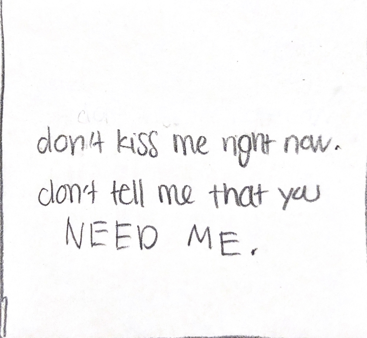
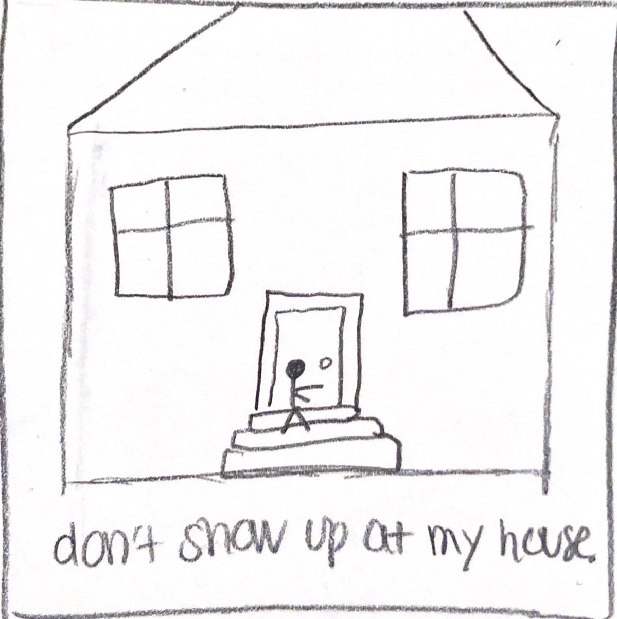
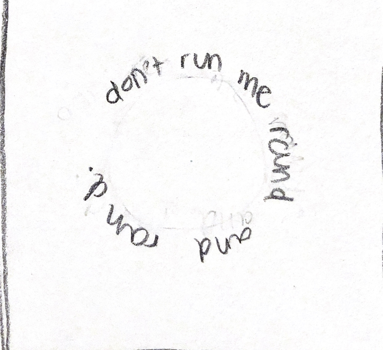
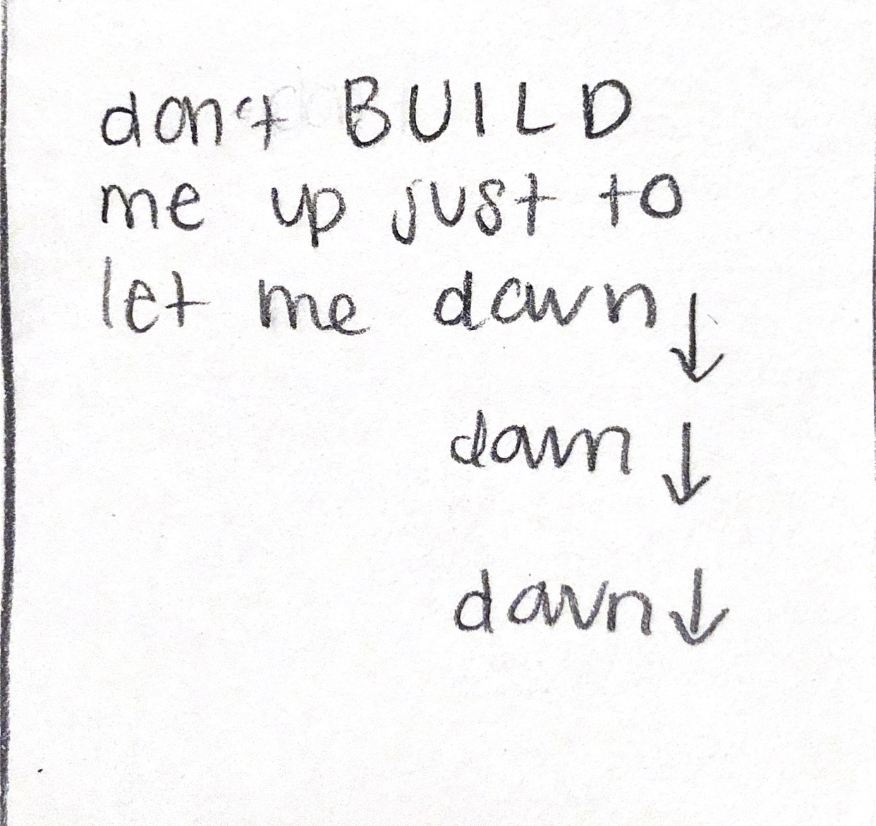
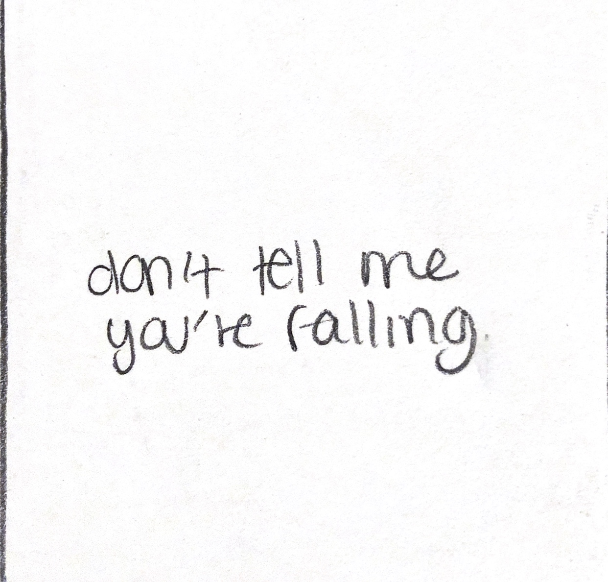
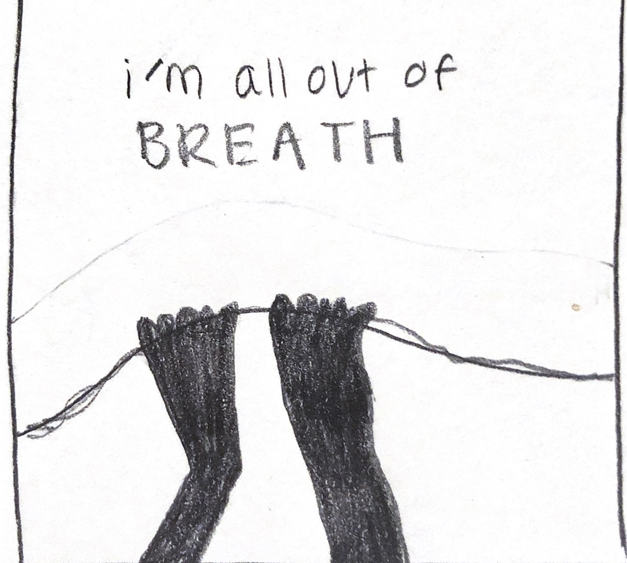
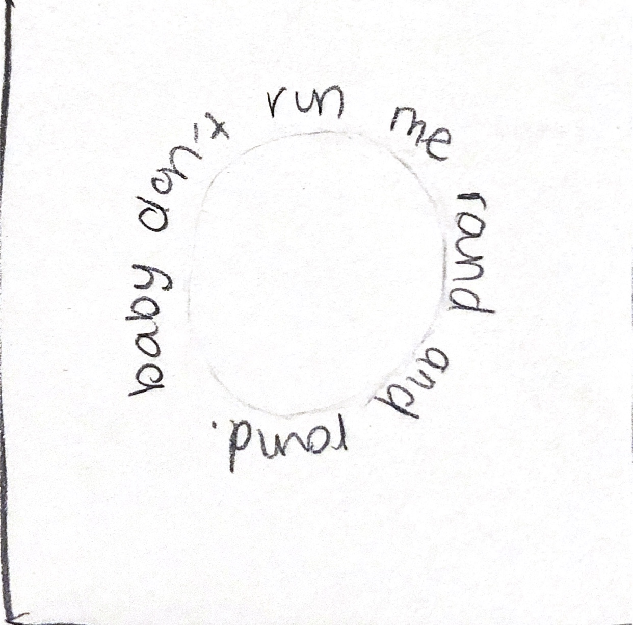
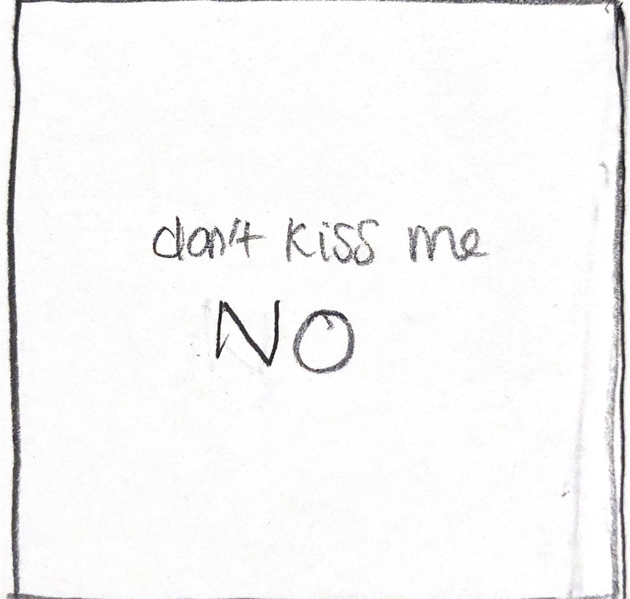
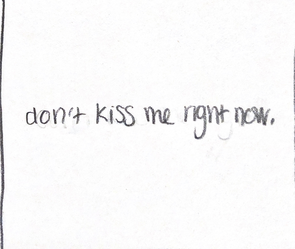
As shown above, these are the thumbnail sketches I created for this project. I chose the song Mean It by LAUV and LANY to animate. When choosing which song I was going to do, I tried visualizing what it would look like first. I decided on this song because it had a lot of meaning within the lyrics and I could visualize it in my head. I sketched out these thumbnails based on the visualizations in my head, keeping in mind how I could animate each frame as well. After these thumbnails were created, I dove into After Effects. In After Effects, I chose the font I would be using for most of the video and started animating the words. I animated based on opacity, position, and background changes to begin with. Then, I went into Illustrator and Photoshop to create the visuals of the frames. I wanted to include these visuals because I decided having just words in the video wouldn’t be as impactful.
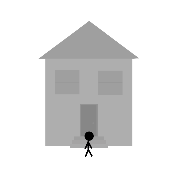
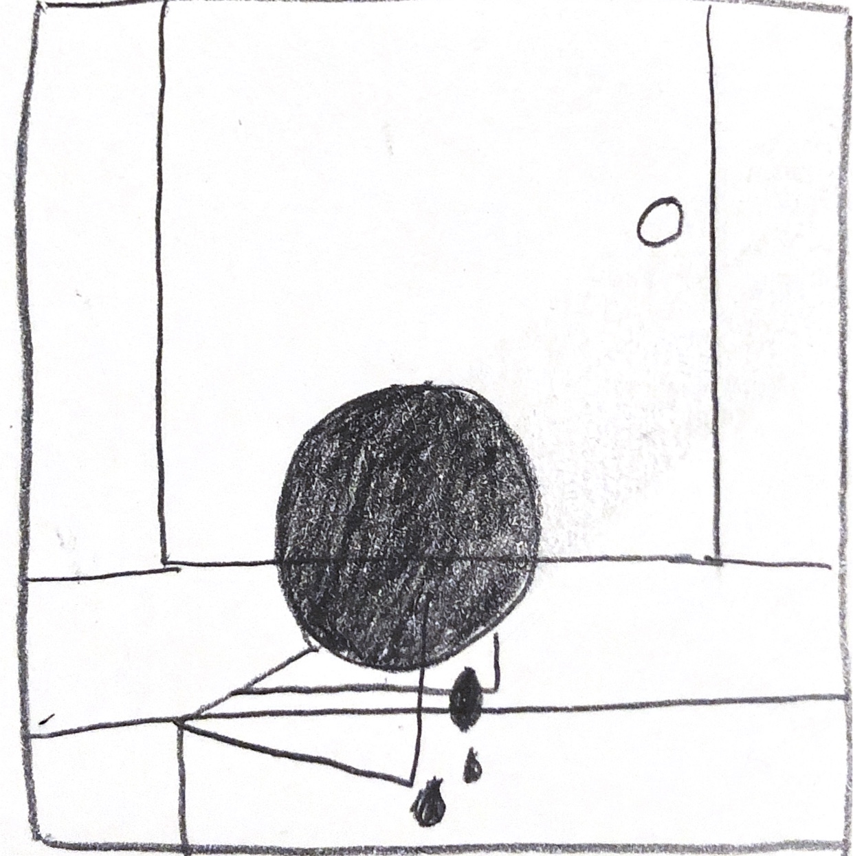
I created this GIF in Photoshop to use in one of the frames. This GIF is of a person crying that goes along with the lyric “don’t show up at my house all caught up in your feelings.” I brought this into After Effects and created the transition of zooming in on the person crying when the timing was right.


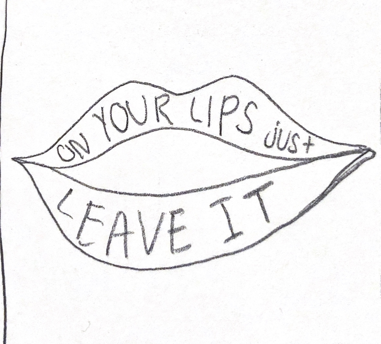
I went on to create other visuals in Illustrator for the frames including a person on a cliff and a pair of lips. With these visuals, I used scaling transitions to incorporate them into my After Effects project.
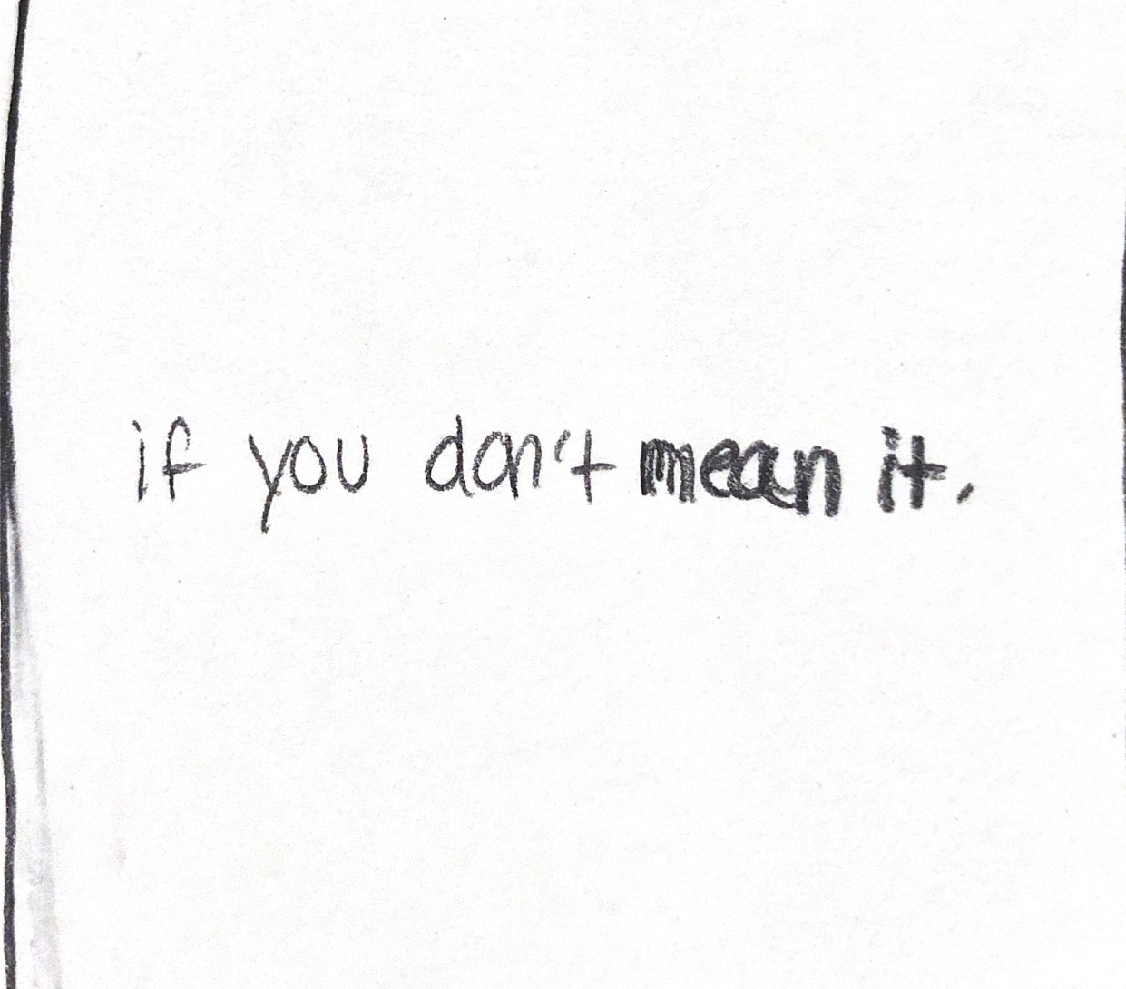
Along the way, I decided to keep and change different things from my original storyboard. I listened to the song over and over to try and create the concept I wanted to. In the end, I was happy with the final outcome and thought it went with the song well. Below is the link to my final version, for now. I plan to come back to it and revise it in the future because life is about change and I can always become a better designer.
