Simple Poster Design

luker_simpleposter

For this assignment, I was able to learn further about InDesign. I created two boxes for the background of the page, making one of them a tint of the other. Then I dropped in images including the Celtic symbol, banner, and bottom gizmo. Since these images were linked, I was able to edit them and have it be updated within my InDesign poster. I then worked with type, changing the font and leading to make it fit well on the page. I was able to work with the layout of it all and make a simple poster design.

#visualdesign

Design Disruptors/Semester Wrap-up

D85D0427-C952-4A0E-AA2B-3088FA2A68F5E689DB79-BE52-4372-ADEC-CD8F6955D127

There are some key differences in the social media user audience of 2015 and 2018. The year 2015, was the Golden Age of social media. Many people were using it to get connected with their friends and family. Since this was a fairly new idea and nothing had been done like this before, many people were on board to start using it. There were almost no problems with the applications and many people had fun with it. Social media was all about the user experience, so the design incorporated things the user wanted to see.

Fast forward to 2018 and the experience of social media has changed drastically. Social media is still about staying in touch with those you love, but it has also turned into an addiction. People are constantly on it and have lost touch with the reality of their lives. Due to this need for connection, people have become lost in the digital social media world. This has caused a number of issues including loss of confidence, eating disorders and a variety of mental health issues. The need to live up to influencers, or people who have perfect lives on social media, has grown insatiable. People have used this platform to make them seem like they are living a perfect life when in reality they are not. Along with this negative side effect, social media is now covered in advertisements. Businesses have grown to use these applications to promote their companies to a wide span of users. Overall, social media has switched from being about user experience to making money and fame.

The designed experience has been swapped from connecting with friends to endorsing ideas. Applications originally meant to share photos with friends have turned into sharing news posts and articles. Facebook is a good example of the design feature swap in social media. Facebook originally had profiles with photos for your Facebook friends to like. As the age of social media shifted, its design incorporated a news feed. This originally was a place to share life updates and other posts. The news feed then morphed into what is now a hub for political posts, breaking news articles, and crazy videos from around the world. A design that was once focused on the user, is now focused on spreading ideas and news. The additional design feature of adding advertisements into the middle of social media posts or videos online has also changed the user experience. A once entertaining time spent on social media has now turned into minutes of waiting for advertisements to go away.

A designers role is to adapt to a changing environment and disrupt the status quo. In the Design Disruptors video, we saw that disruptions created by designers are what helps our society function. Designers must look at what exists in our society and put something out there that disrupts it. This is often seen as a solution to a problem many people have gotten used to in life and don’t realize is there. An example of a design disruption was the development of Uber. People were getting place to place using taxi cabs, but these weren’t located everywhere. The development of Uber allowed an easy experience on your phone to get a ride anywhere. Many people didn’t realize the issues along with the taxicab service and once this application came out, their lives were made much easier. Design disruption is seamless and the perfect design doesn’t add problems to society. These designs will integrate into society like they have already been there and add a lot of efficiency in people’s lives.

An application that has changed from when it first came out is Netflix. Netflix was created to have users be able to access movies online, while also sending a monthly subscription of DVD’s straight to your door. This originally was a way for users to get access to many movies without having to leave their own home. Netflix has now switched to focus more on the movies and television shows online, rather than door to door. Netflix has obtained a variety of popular shows and has grown in popularity during recent years. It offers a way to get access to newer movies and watch all the seasons of your favorite shows without commercials. Netflix has taken over users in regards to watching regular television. It has also begun to create its own television series and movies to watch. I predict that in the coming years, it will start focusing even more on its own productions and become an exclusive television and movie network. People will then have to subscribe to the application to watch its exclusive media.

Going back to the application of Uber, it has changed from being a ride service to a well-known part of society. It has become very popular and one of the number one ways to get around. Songs have been written about it and many celebrities have endorsed it. The only negative aspect is the effect on taxicabs. Uber is often the first choice for getting a ride and some taxicab services have been hurt by the app. I believe Uber will wipe out taxicabs in the near future and become one of the only ride services around.

Instagram is another application that has changed over the years. It went from being a platform to share pictures with followers to a full on business. Influencers grew out of this application and began earning money from their picture-perfect posts. Sponsored advertisements also started popping up in feeds and stories, whether the users wanted them or not. Instagram then developed more features like stories and going live online. After all these added features, in the future, I can see Instagram becoming one of the most popular apps to date. It will grow further as a business and become even more successful. More people will earn fame from it and it will offer more users a way to make money.

My biggest takeaways from this class have been understanding the foundations of design. Going into this class, I thought I knew what design was. My perceptions were changed as this class opened up my perspectives on the ideas of design and the many ways it functions in our world. From the design thinking process to making disruptions in society, I learned that design is an important tool to utilize. I understand how the design thinking process fits into many aspects of our society and can be used to create many successful ideas and products. In my future career as a graphic designer, I will take this knowledge and use it in my design work. Having the process of design thinking will allow me to ideate and create needed designs for society. After all, I’m not designing for myself, but for everyone else.

#designresearch

Drawing with the Pen tool

luker_pentool

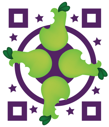
To complete this assignment, I traced the pear given using the pen tool. I made sure to pay attention to detail as there were many different curves. Then I filled the shape with a color and used the blend tool to create a gradient toward the bottom of the pear, adding depth. I did the same with the leaves on top to make them look more realistic. I created copies of the pears and arranged them on the page, adding an interesting background of shapes.

#visualdesign

Logo Silhouettes

luker_silhouette

These are a series of logos I found and traced. For each logo, I brought in the logo picture from the Internet and placed it in a square. I then created a layer on top of that and with the pen tool traced over the lines. I made sure to pay close attention to the curves of the logo because otherwise, it would be a bunch of straight, jagged lines. I chose logos that had some aspect of interest in them and that weren’t just plain squares.

#visualdesign

Wordplay

Processed with VSCO with b1 preset

In class, we began discussing blackout poetry by looking at examples of Austin Kleon’s work. While he was stuck with writer’s block, he created a variety of poems simply by taking newspaper around him and crossing words out with a black marker. Words or phrases that interested him he left on the page and eventually a poem was made. Blackout poetry is traced back to centuries ago and with new technology has begun to be used again. I created three poems using the newspaper I was given. Although seemingly an easy task, it was difficult to connect the words together to have an understandable poem. At first, I was only looking for interesting words, but as I went along, I realized how interesting it was to find phrases to use. I changed the entire meaning of these phrases by incorporating it along with other words in my poem. After finding the words and phrases I liked, the most difficult part of the task was connecting them together. I then had to try and find connector words like “is”, “to”, “and”, “a.” These helped me connect my poem and create more of a flow.

9F4640A1-1A7C-421B-A82D-AA99F53AE423

For this task, we were asked to create ransom notes. Ransom notes usually involve different fonts and styles of letters from different sources. They are often cut up in the way shown above at a random order to spell out a demand. This is a form of wordplay because different letters from different places are being used to create an entirely new message. Our task was to create a ransom note that looked visually appealing from the sources we were given. I created the demand, “Give me the cookies at midnight and you can keep your job,” because it was funny and something that stands out from other phrases. To go about this, I went through the newspaper and attempted to find various different letters. At first, I was looking through the newspaper, cutting out letters at random that I thought would add contrast. After a while, I realized it was easier to start forming my words, so I began looking for each word. I tried to cut letters from multiple different pages, looking for interesting backgrounds, different size fonts, capital letters and more. I realized the more contrast in type I found, the better it looked. Eventually, I created my demand and decided to stick it on a pink piece of paper so it would stand out. This ransom note reminds me of Mean Girls and the pink “Burn Book” with letters.

Overall, working with wordplay was fun. It opened me up further into the world of creating messages and new meaning to words. Working with material already provided is an interesting way to create something new. I learned it is all about modification and putting your own style into something existing.

#designresearch

Tell a Story with Storyboarding

For this warmup assignment, we were asked to copy a storyboard of a cowboy at multiple angles. The article Learn the Lingo, Camera Shots & Techniques in Storyboarding talks about the importance of having different shots in the storyboard and knowing the names of them all. For this assignment, we focused on having an extreme long shot, long shot, knee shot, medium shot, and close-up. For the first storyboard, the cowboy was copied to a tee with the given template. For the next two, we were asked to create storyboards using animals and nature. I created a storyboard using a horse and used multiple types of shot angles to create my board. For the next board, I drew a tree using the multiple angles as well. As I began drawing each board, it became easier to draw the different angles. Through this process, I learned how crucial storyboarding is for a story and how sketching ahead of time helps bring the story to life.

For the event storyboard, we were required to create a storyboard of a fundraiser in groups. The storyboard had to show the visual experience of going to a fundraising event. Our group chose an organization for school supplies for kids in need. We decided the Kids in Need Foundation would be the best fit for our fundraiser. For this fundraiser, we wanted to create something formal that possible donors would be attracted to going to. We drew on sticky notes the various steps that people would view at the event. We included a check-in, raffle room, dining room with dancing, an auction, and display room. While thinking of the steps to put, I thought back to my own fundraising events I had gone to and the different attractions they hold. I realized having a sit-down dinner and an area to walk around it was important for the guests to experience. After our drawings, we went around to each of the groups and either approved or got rid of certain steps. The pictures above are of my refined fundraising storyboard. We were asked to individually look at the advice given and redraw our own storyboard. I used the feedback from the groups around the room and got rid of certain drawings. An example of this is with the dinner scene when many of the groups thought to show this step was unimportant. I refined the scene to show a close up look at the guests around the table eating dinner to make it clearer to the viewer the step that was going on. I continued to make sure enough details were present in each scene to help visualize the fundraising event.

F1D504D9-50D2-43E9-82EC-B9E1613B95CB

During this in class assignment, we used storyboarding in a different way. We created our own images to be placed on buttons and to tell a story at the same time. Our task was to use three buttons to tell the story of why someone should vote. First, I looked through a variety of issues and topics surrounding why someone should vote. I decided on using the topic of the environment and voting to help end pollution. I sketched out my ideas using three circles and eventually created my final three images to be pressed into buttons. The story shows a dying flower due to pollution, someone voting for a candidate who will help end pollution, and the world becoming pollution-free, with the flower thriving. This exercise shows how simple a story can be to get a big message across. The act of storyboarding can help in simplifying or explaining a process unfamiliar to other people. By going through this wide variety of activities, I was able to see the importance of storyboarding and why we use it.

#designresearch

Not just Brainstorming, but Gamestorming

Processed with VSCO with a5 preset

Gamestorming involves the process of brainstorming new ideas in a game-like way. It is a fun, collaborative way to think of innovative ideas by using imagination. Gamestorming allows an office to be turned into an alternate reality, unlike many other traditional office settings. It uses low tech, fun methods to get ideas flowing and people excited for work. In the Gamestorming video, it talks about major companies today such as Apple, eBay, and Facebook, that was started by young adults. These young minds brought more creativity to the table and used this method to build their companies. Now, they are some of the most successful companies today, which can be attributed to their non-traditional workspace.

The rules and methods of Gamestorming are endless. Each company working this way can come up with their own set of rules and activities. Making the work enjoyable is one of the top priorities. In class, we were able to understand the variety of ways Gamestorming can take place and how much it fosters collaboration.

For our class activities, we were required to draw a cover story, complete a SWOT analysis, design a mood board, and create spectrum maps. All of these different methods allowed us to think creatively and non-traditionally.

For the cover story, we were asked to redesign a new Facebook that is focused more on community rather than news. We drew a magazine cover complete with headlines, quotes, and images. For the SWOT analysis, we had to figure out the strengths, weaknesses, opportunities, and threats of pop-up experiences. This type of analysis allowed for many of the features of the pop-up experience to be looked upon. The mood board was created on Pinterest that conveyed easily reusable and simple packaging. After creating a product, it is important to have the right packaging to sell it in. Lastly, we created spectrum maps of various political views showing the extremes of each side and in between. Our map involved the gun control debate, government funding, and marijuana use.

The process of Gamestorming allows for greater collaboration, creativity, and innovation. I believe it should be implemented into more companies to allow for more ideas to be generated.

#designresearch

Social Awareness Poster


luker_awarenessposter

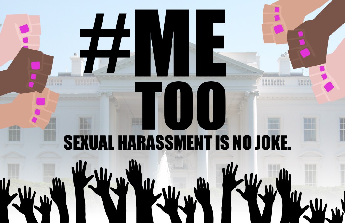
While creating this social awareness campaign, I thought of the problems that were currently occurring in our society. Brett Kavanaugh and his trial surrounding sexual harassment were going on during this time and I thought it was fitting to create a poster about the movement. I realized that Kavanaugh wasn’t the only focus of the movement and created a poster to focus on the more general idea of politics. I used the masking technique on the background to emphasize the hands rising up from the movement. I created all the different types of hands based on one hand image. I then created a masked background of the White House to emphasize the political scandals that have occurred surrounding sexual harassment. I masked the background so it didn’t distract from the overall meaning of the piece. The fists on both sides are coming down on the White House representing the power of women rising up. I paid attention to the design principles of contrast, proximity, and balance in creating this piece. The image is 17 by 11 in, RGB mode, and 150 PPI.

#visualdesign

Testing is essential to the user

Processed with VSCO with a5 preset

Testing is an important step in the design thinking process. It is technically the last step of the process, but this isn’t usually the case. After testing, designers often go back to their work and revise it based on the comments of the participants of the test. Taking in the feedback of the participants can allow for the prototype to be redefined and for the final product be made easier to use. When creating a product, one of the main goals is for it to be easy to use and for the user to understand how it works. If the use of the product isn’t clear during the testing phase, then it is important to go back and make it clear.

According to the article Stage 5 in the Design Thinking Process: Test, the best types of tests are completed in a natural environment where the participant is comfortable. This will help remind them of reality and allow them to relax while completing the test. They should also be solely observed by the tester during the test. If the user figures out how to use it on their own and isn’t told what to do, this will allow the prototype to be tested to its full capacity if the user figures out how to use it on there own and isn’t told what to do. Observing during the test and asking questions after will allow for the most useful feedback.

Products are always changing and the best example of this is the simplified Samsung Television discussed in the article User Research: What It is and Why You should do It. Samsung created a minimalistic television hiding all the bulky cords as they noticed users were beginning to use their televisions for decoration over function. Testing products in real life situations and garnering feedback will allow for more refining to fit the user’s needs.

In class, we started up our functioning app prototypes and began the testing phase of our wacky app process. Above is a picture of my wacky app’s home screen on the working app prototype. We went around testing our apps between different students in the class. I made sure to test my prototype with at least three of my classmates to get the most feedback. While testing, I followed the guidelines of testing we had learned through the readings and in class to get the best results. I got the prototype running for my participants and watched as they navigated through. I took notes, making sure to pay attention to detail, of where they tapped and their expressions while doing so. I allowed them to play around on the wacky app until they deemed fit and gave me feedback. I asked them how I could improve and if anything was hard to understand for them. Using their feedback, I ended up making minor changes to my screens to allow the app to be more functional.

In the end, after the testing, I had a mostly completed app. If there were more time I would’ve tested the app again after I made the changes. This could allow me to refine it more with a different set of students. Overall, testing is an important step in making sure the product works in reality and is usable to everyone.

#designresearch


Retouching Work

Gillian-retouching

sitting-on-a-bench           boat-retouch

To create this retouching piece, I used the magic wanted to select the area I wanted and added a layer with color on top of my desired area. I then overlayed this color over the area in order to still be able to see the details underneath. This is an example of non-destructive editing. During retouching, I followed the design principles of color, contrast, and more to make sure everything looked the best it could be. All photos are in RGB mode. The retouching including two pictures is 72 PPI and 88.9 by 59 inches.

#visualdesign