The final prototype features a complete redesign of the app, Mindfulness Coach. This app is a self-care app that focuses on improving mindfulness and overall healthy habits. I worked with a partner to completely redesign this app, from backend to frontend. We focused on researching and using UX and UI best practices. Our final app prototype features well-designed screens with working functionalities.
The original Mindfulness Coach design was an “ugly app”. The screens weren’t well laid out and it was hard to navigate. After much user research, we created an information architecture that mapped out user navigation in an understandable way. By doing so, the functionality of our app was able to be used more efficiently.
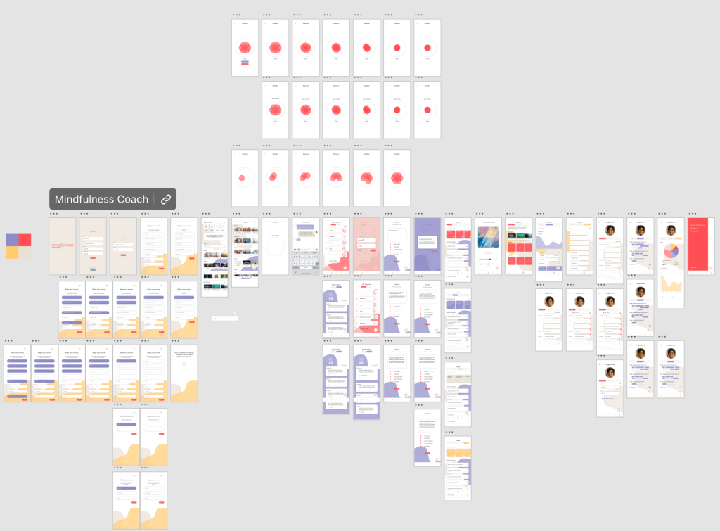
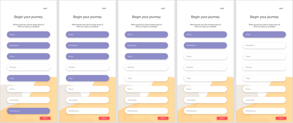
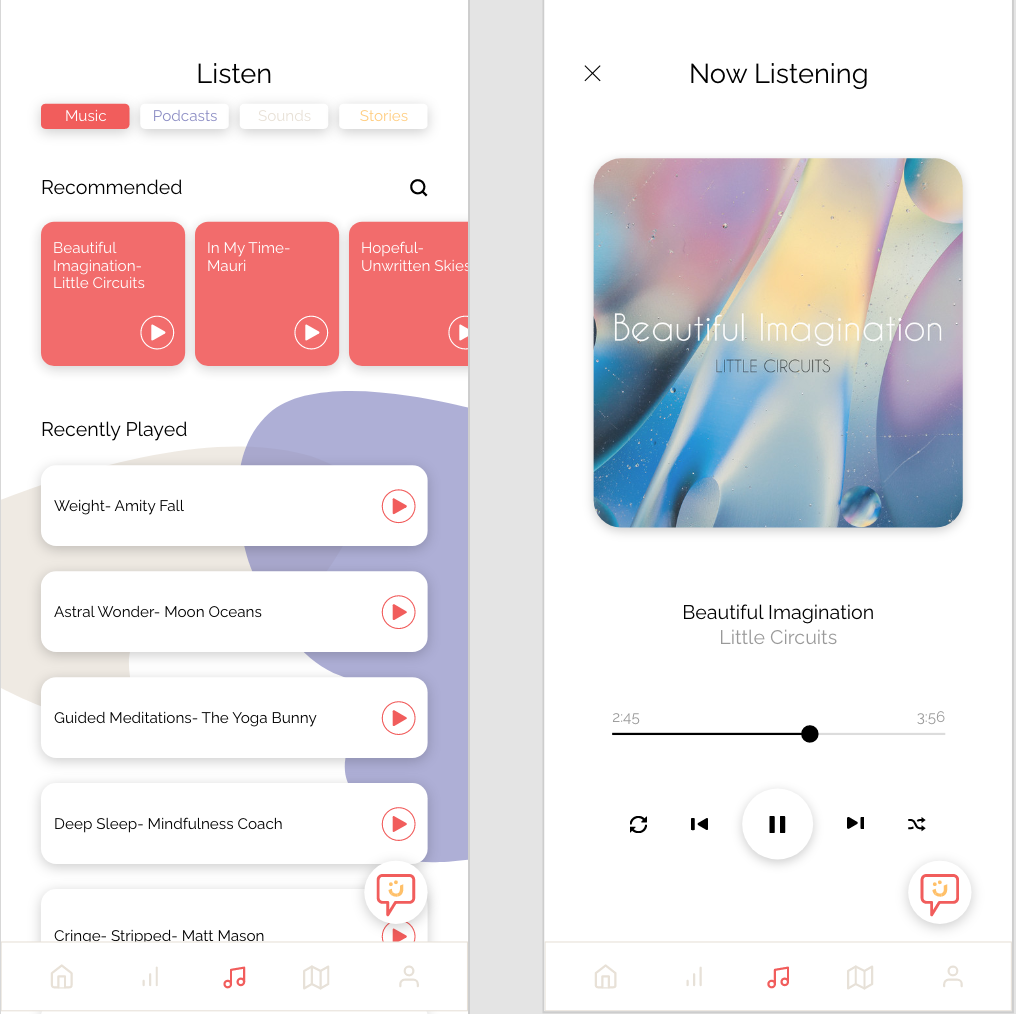
This prototype features screens such as sign-in, customization, and different categories of self-care. We wanted the user to be able to customize their experience and track their productivity as they go through the app. Because of this need, we incorporated screens that ask the user personalization questions and allow them to write down their future goals and concerns. The prototype also features a mock live chatbot that talks to the user in “real-time.” Other features include different media such as videos, music, and live animations that walk you through various self-care activities.
Much research was put into finding color schemes and fonts to place on the screens. We ended up color-coordinating different self-care categories of the app so the user would remember and recognize which style of self-care they were using.
This prototype is a culmination of extensive UX/UI research. Having this background allowed for both a successful and realistic-looking prototype.
After narrowing down the wireframes and functionality of an interface, it is time for more user interface design. User interface design, also known as UI design, is granular. It involves taking small components and turning them into functioning screens (A Comprehensive Guide To UI Design).
This process can seem overwhelming on a large scale, but it is all about organizing it down into smaller chunks. A common way of organization is by creating an interface inventory. This inventory can include all the small components that go into your designs, including but not limited to:
If you already have an existing interface, you can add these components to your inventory and synthesize what you still want to use. If you are starting from scratch, visual research needs to be done.
When conducting visual research, make sure to research each type of component you will be adding to your inventory. This research is usually done by copying top designers and looking for successful design inspiration. No need to reinvent the wheel (7 simple & effective methods to get better at Visual/UI Design). These are some popular websites to find inspiration while researching:
On these websites, you can view screens, entire application layouts, or even just simple components. The possibilities are endless when it comes to inspiration.
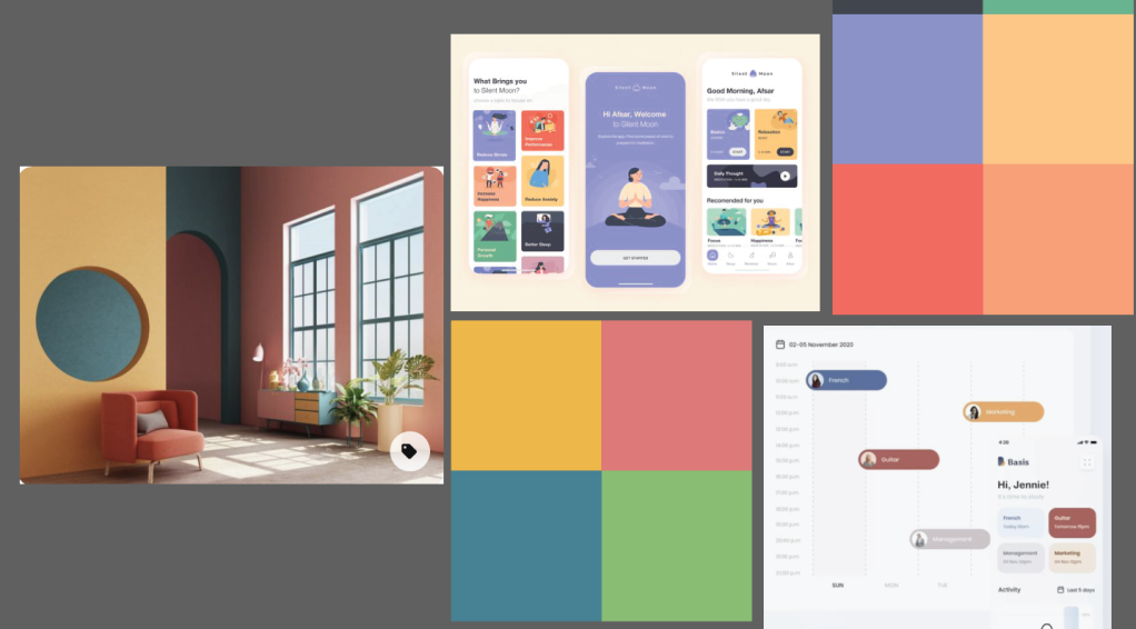
Visual research for my app redesign
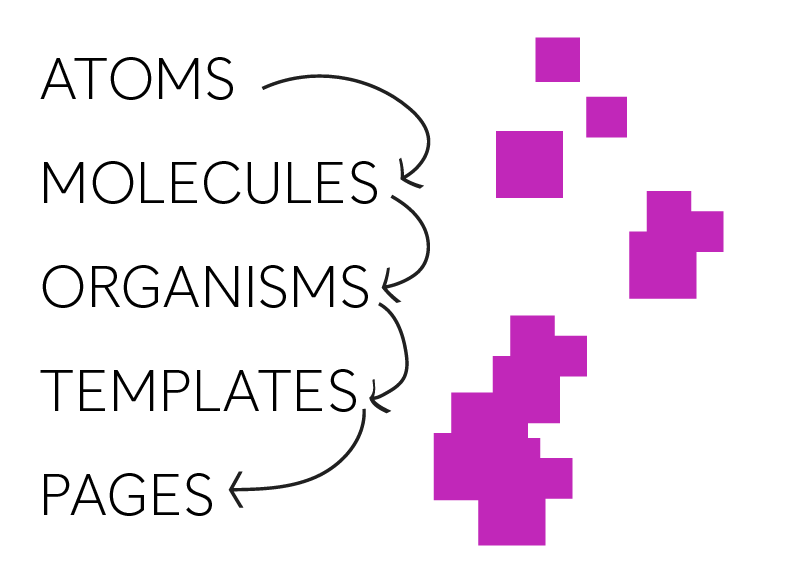
Once you have your components organized, you can then design them atomically. Atomic design involves building from these small components up to large interfaces, just as atoms go to molecules go to organisms go to templates go to pages (A Comprehensive Guide To UI Design). Take your components and slowly build them into working prototypes. Keeping to this design process will allow you to efficiently design cohesively and create successful design layouts.
There are a lot of free UI kits out there that can help you with this process. Many of these kits include smaller components and how they can be organized 0nto a screen. Taking the time to look at these successful designs by using free tools will help you tremendously.
As you design screens, there are some important things to keep in mind. Luckily in 7 Rules for Creating Gorgeous UI there is a synthesized list of some tips and tricks to follow:
Light comes from the sky
Add in shadows to buttons that should be pressed; light where light is needed
Black and white first
Don’t get too distracted with colors and fonts while designing, design in black and white first to make sure the functionality of the design works
Double your whitespace
Give your items room to breathe as you place them on a page, don’t bombard the user with too much information close together
Learn the methods of overlaying text on images
Make sure the text can be visible if its on top of an image
Make text pop and un-pop
Give your words a hierarchy, those that are more important should pop off the page
Only use good fonts
Use fonts that are web safe and will be easy to read on the intended device
Steal like an artist
Most of this has already been done before, no need to start from scratch, so use what’s out there
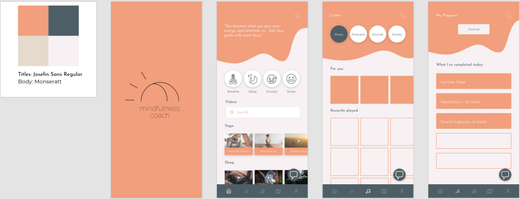
My compositions of screens based off visual research
Following these organization and inspiration processes will lead you to success in designing user interfaces. Always make sure to keep things cohesive and functional.
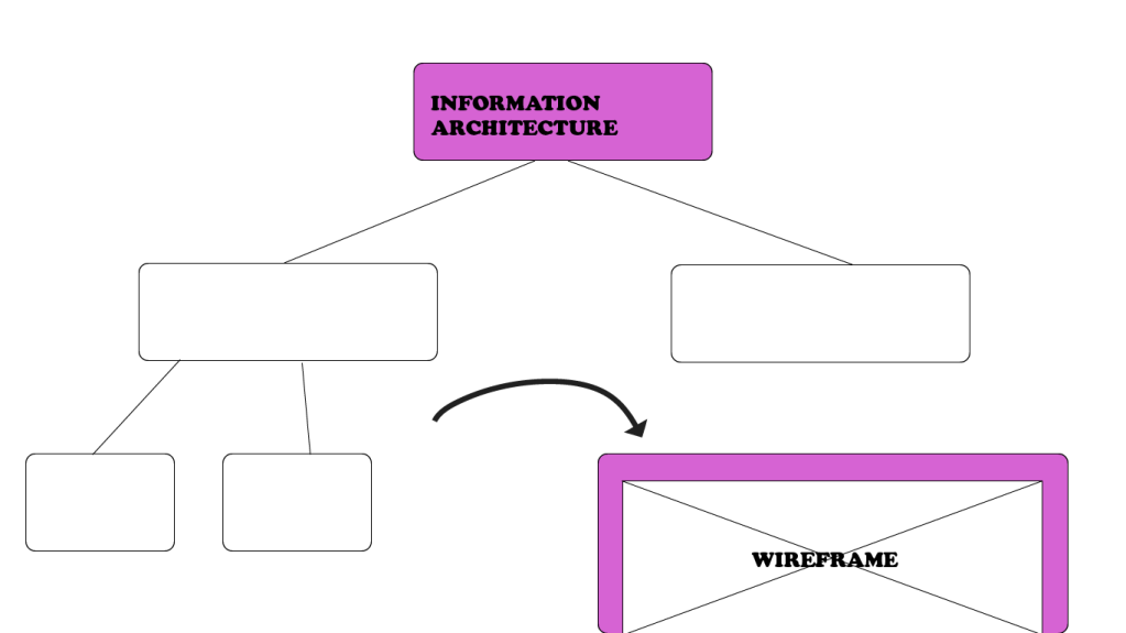
After finding insights from user research, it is time to start designing the layout of your screens. It is important to use your user research in order to figure out the best user flow and layout that will be successful in your final product. Designers accomplish these added insights by creating information architectures and wireframes. Read below to find out about the processes for creating and using both of these tools.
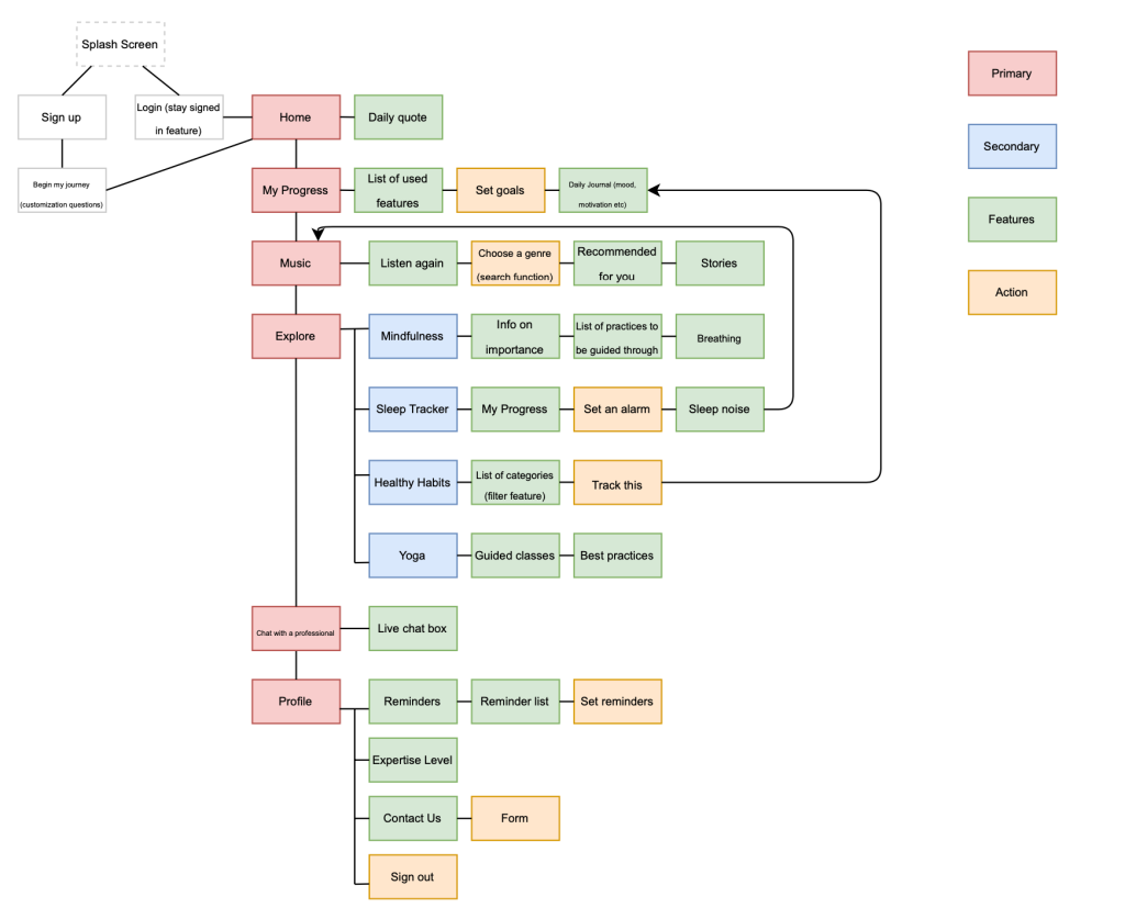
“Information architecture is the practice of deciding how to arrange the parts of something to be understandable” (Information Architecture. Basics for Designers.). You now know all the elements you must include in your product, based on user research, but how will you go about making the use of them understandable? An information architecture, also referred to as IA, can go a long way in mapping out this understanding.
Information architectures are like flowcharts. They consist of shapes that contain different navigation elements and pages within an application. There are two main rules most designers follow when making an IA:
Organizing it through a visual hierarchy (that is, a hierarchy of features, functions, and behavior)
Creating a legend for displaying different types of features, interactions, and flows.
The IA not only holds each individual page but actions and functionality as well. You can add in as much detail you want to it, including what type of search engine will be there or exactly what page a button will lead you to when pressed. It is all about organizing the functionality and making it easy to use.
My Information Architecture for a self-care application
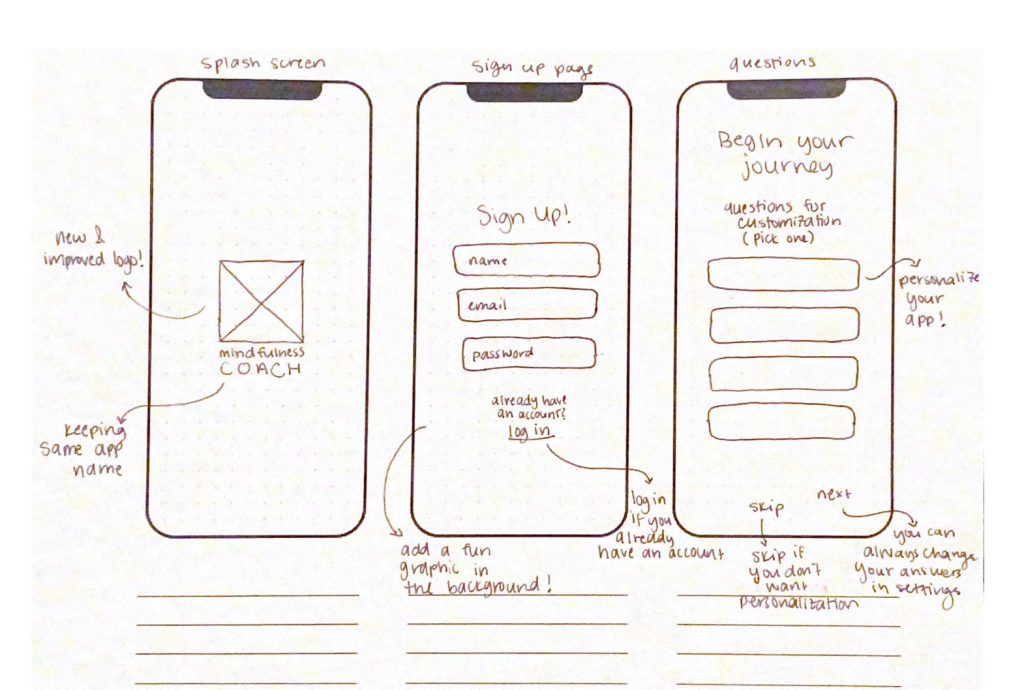
Once you map out your information architecture, you can sketch out the layout of your screens. These sketches, digital or print, are known as wireframes. They are a way to get user flow presented visually. It is a low-cost and low-fidelity process. Wireframes are not the final product by any means and can be changed at any moment. The purpose of wireframes usually is to:
Present info that will be displayed on a page
Give an outline of structure and layout on a page
Convey overall direction and description of the user interface
Once you sketch through this process, when you arrive at your final product you will know what to do and how to move it forward. Wireframing is just a stepping stone in getting closer to that working prototype.
Although wireframing consists of simple layouts, it can be daunting to sit down and start making them. They need to be based on research and contain a good functionality to them, something that is hard to do if you go blindly into it. Below is a list of tips for approaching the wireframing process:
Do your research: user research must be the reason behind your sketches
Prepare your research for quick reference: come up with a list of your main goals and cool features to look at while designing
Make sure you have your user flow mapped out: know where your users are coming from and where you want them to end up, a good information architecture can help with this
Draft don’t draw, sketch don’t illustrate: keep it simple, not too many small details
Add some detail and get testing: add detail from top-down and left to right, start connecting form and functionality
Start turning your wireframes into prototypes: move your wireframes to the next step
By following these guidelines, you can make sure your wireframes will be useful to you in the future.
An example of some sketched wireframe screens with notes
So start designing for function. Figure out how your user is going to tap through your prototype and what kind of screens they will be expecting. Remember, you can always iterate.
In the design process, after collecting user data, your next step is to define your data. To be able to define data, you must analyze it and present it in a way that is helpful to you as a designer. Two key ways to find this definition are by creating empathy maps and personas. By completing these processes, you can further analyze your data and find a greater understanding of your user.
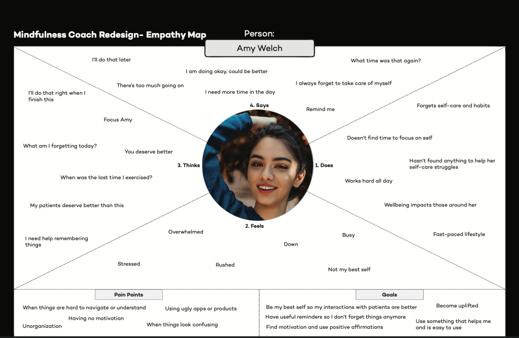
“An empathy map is a collaborative visualization used to articulate what we know about a particular type of user.” Making this map will help to:
Although putting all this information together into a map may seem daunting, it stems from user data. It includes the data you have already collected, consisting of repeating trends and direct quotes, that will be useful to add to the map. Some designers even have their users directly fill the map in, coming straight from the source. Other times, it takes some assumption and analysis of data to complete it.
An empathy map consists of what the user says, thinks, does, and feels. Each of these categories, plus any other you decide to add, will offer a new insight to your design process. Here is a list of what is generally included in these sections of the empathy map:
Says: ideally contains direct quotes from research; something the user would most likely say
Thinks: what the user might be thinking, either based off what they shared or what you assume they might be hesitant to share; what occupies their thoughts and what matters to them
Does: what they physically do with the product; what they do in their lifestyle
Feels: whatever emotions they express during user research, what worries them, what excites them etc.
Taking the time to delve into all these categories will allow for more opportunities to find new insights. Once you complete your empathy map, you can use it for a variety of reasons. You can use the map to figure out your overall design challenge, what the main issues you need to be focusing on are as you iterate. You can also look at the map through Maslow’s Hierarchy of Needs, determining what the user needs first and foremost and working your way up to more trivial needs. Lastly, you can use your empathy map as a background for creating personas (Empathy Map – Why and How to Use It).
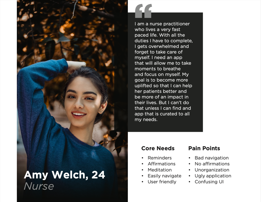
Personas offer more in depth knowledge of your user. They take the synthesized data and place it into the form of a realistic user. This process allows the designer to focus on “one user,” which actually encompass the majority of your user groups, rather than all their users at once. The following are 7 easy steps in creating a persona:
Research
Get user data about your target audience
Segment your audience
The persona is a small segment of your target audience, it isn’t just one person
Set demographic info
Include researched background info on your user (name, age, marital status, job, personality, etc)
Describe persona background
Write down details about their background, tiny details can give good insight as well; avoid confusion
Define persona goals
See if the goals of your product align with the needs of your user
Motivations & pain points
Shows you how to win their hearts and keep them loyal to the product
Add other ingredients
Add more info about the user’s skills, tech level, influences, etc
Once you create this persona, you will have someone in mind to think about as you make more design decisions. It will be a reminder for you and your team to focus on the user, making sure their needs are being met.
These processes of synthesizing data are key parts to the design process. Without them, it would be very difficult to find a direction to move forward in. This allows you to know your user well and find out what your research about them actually means. Doing these processes will go a long way in terms of actually understanding your audience.