For this project, we created a document with three columns and added the text. Next, I changed the text to a different font, italicized it, and added paragraph style, emphasizing the “A” at the beginning of the paragraph. I then added in different pictures, using text wrap to shift the text around the photos. I then placed a background photo towards the bottom of the page and feathered it to fade more. This way the text is legible. After this I added in the lines at the top, adding more of a design to the page.

For this assignment, I was able to learn further about InDesign. I created two boxes for the background of the page, making one of them a tint of the other. Then I dropped in images including the Celtic symbol, banner, and bottom gizmo. Since these images were linked, I was able to edit them and have it be updated within my InDesign poster. I then worked with type, changing the font and leading to make it fit well on the page. I was able to work with the layout of it all and make a simple poster design.
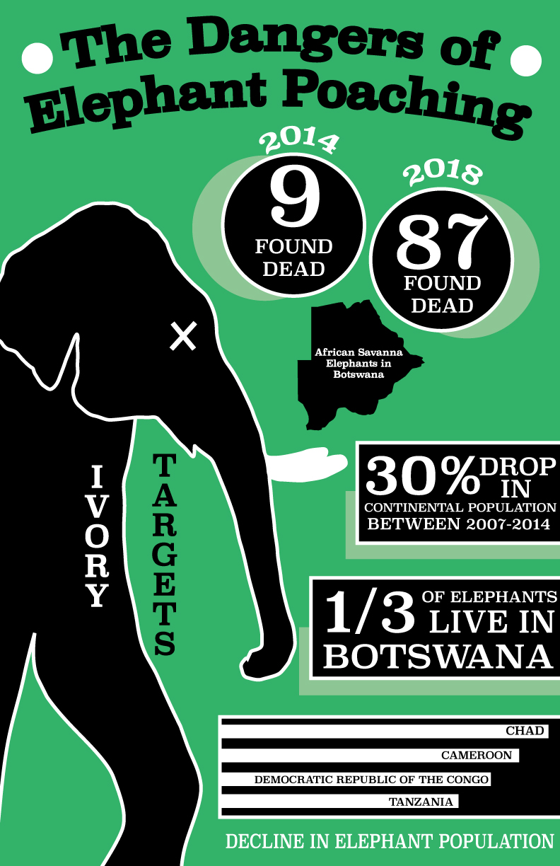
I was interested in researching this subject because elephant poaching has always been a cause I cared for. I love elephants and I don’t understand why people would take their lives just for parts of their body. They are gentle creatures and should be protected. I got the numbers of killings from an article by National Geographic. The article was about the recent killings that have been happening in Botswana, supposedly a safe haven. While designing my work, I considered the design principles of color, contrast, alignment, and shape. I wanted to make sure everything stood out in its own way and was evenly spaced across the page. The website I used was:
https://www.nationalgeographic.com/animals/2018/09/wildlife-watch-news-botswana-elephants-poaching/

These are a series of logos I found and traced. For each logo, I brought in the logo picture from the Internet and placed it in a square. I then created a layer on top of that and with the pen tool traced over the lines. I made sure to pay close attention to the curves of the logo because otherwise, it would be a bunch of straight, jagged lines. I chose logos that had some aspect of interest in them and that weren’t just plain squares.
To complete this assignment, I traced the pear given using the pen tool. I made sure to pay attention to detail as there were many different curves. Then I filled the shape with a color and used the blend tool to create a gradient toward the bottom of the pear, adding depth. I did the same with the leaves on top to make them look more realistic. I created copies of the pears and arranged them on the page, adding an interesting background of shapes.
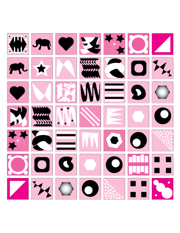
I created the boxes, making sure to reflect and space each box evenly. After getting my desired number, I began coloring the boxes. I wanted to use a pink color scheme, so on the top row and left column of boxes I made a gradient of pinks going from light to dark. I did the same pattern of pink boxes in a row diagonally down the center. I then used black and white colors to fill my boxes because they have the most contrast. I tried to make each box slightly different while also keeping in mind the symmetry of my designs.


For these assignments, we completed them in class as we began to learn the basics of Illustrator. We created the pencils using the shape tool and getting rid of various lines to form new shapes. Then we added color, making sure to pay attention to highlighting and shadowing to make the pencil look more realistic. Finally, we put our own spin on it, so I created a border with two pencils drawing. For the elephant project, we were each given the elephant outline and ask to fill it in. We used keyboard shortcuts, color swatches, and gradients to fill in the variety of parts. After I finished I used the spray paint tool to create the various flowers in the front. I added various effects to them to make them look different. I changed the sizes, shades, and arrangements of the flowers.

While creating this social awareness campaign, I thought of the problems that were currently occurring in our society. Brett Kavanaugh and his trial surrounding sexual harassment were going on during this time and I thought it was fitting to create a poster about the movement. I realized that Kavanaugh wasn’t the only focus of the movement and created a poster to focus on the more general idea of politics. I used the masking technique on the background to emphasize the hands rising up from the movement. I created all the different types of hands based on one hand image. I then created a masked background of the White House to emphasize the political scandals that have occurred surrounding sexual harassment. I masked the background so it didn’t distract from the overall meaning of the piece. The fists on both sides are coming down on the White House representing the power of women rising up. I paid attention to the design principles of contrast, proximity, and balance in creating this piece. The image is 17 by 11 in, RGB mode, and 150 PPI.


To create this retouching piece, I used the magic wanted to select the area I wanted and added a layer with color on top of my desired area. I then overlayed this color over the area in order to still be able to see the details underneath. This is an example of non-destructive editing. During retouching, I followed the design principles of color, contrast, and more to make sure everything looked the best it could be. All photos are in RGB mode. The retouching including two pictures is 72 PPI and 88.9 by 59 inches.

Ethics and plagiarism in design are very important in today’s society. Due to the Internet being the number one research source for ideas, many designers choose to show off their works online. This allows their work to be seen and for them to possibly earn more money from users who would like to use them. The issue arises when the proper credit is not given to the designer. Designers often spend a lot of time on each design, planning and creating it. For someone to go online and use their work as their own without giving credit is unethical. Google is a platform that allows problems like this to occur daily. It allows users to search for exactly what they want and copy it directly into their own work free of charge. This problem is only getting bigger as the content is becoming easier to access at our fingertips. Making sure to find images labeled for reuse and modification or getting the owner’s consent is highly important. This will help save time in the future from having a dispute over a piece of copyright work. This is what happened to the Modern Dog Company when Target used their artwork to be sold on t-shirts. By being ethical in what designers use in their work will allow no copyright concerns for the future.
http://www.ethicsingraphicdesign.org/dog-eat-dog-world/
http://www.ethicsingraphicdesign.org/legalities/plagiarism-and-appropriation/
http://www.ethicsingraphicdesign.org/category/plagiarism/

To create this project I used three photos and incorporated layer masks onto them. I used the mask tool, brush tool, and gradient tool to create my desired masking effect. When designing my project I considered the principles of contrast, line, space, and color. I wanted to make the silhouette stand out while also fading into the background. This image is 12 by 12 inches, RGB mode, and 150 PPI.

This was the first image I created using 7 photos. This piece is for social awareness of the harmful effects of plastic and what it does to the turtles. This turtle is surrounded by plastic everywhere it goes, even when getting out of the water. I took in different images from the internet and pasted them on the document, using the masking method to select. I considered spacing and contrast to make the image look realistic. I have some negative space filled with just a beach background. This image is in RGB mode, is 12 by 12 inches, and is 150 ppi.

This is the second composition I created, also demonstrating social awareness. This shows a turtle in an empty ocean in the middle and the reality of our oceans today. The middle is what should be happening but instead the ocean is filled with plastic. I used the same process as the one above and rearranged the photos differently. I used the principles of contrast, spacing, and color in my design. Negative space is used to show the empty ocean free of plastic. This image is in RGB mode, is 12 by 12 inches, and is 150 ppi.
#visualdesign
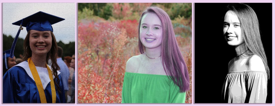
To complete this altered images piece, I first brought all three of my photos into Photoshop. Then I decided which one was the smallest and altered my images to be the same height as the smallest. This is important because images can be easily made smaller, not bigger. I then put them on the same document and separated them, adding different filters and spacing in between. I used the principles of spacing, texture, color, and contrast. The color mode is RGB, with dimensions of 48 by 19 inches, and a resolution of 150 ppi.
#visualdesign
